Designing for an Earth first clothing brand rooted in sustainability.
Tentree was founded in 2012 by two best friends, David Luba and Kalen Emsley, in Regina, Saskatchewan. The idea was simple - they wanted to plant ten trees for each tentree item purchased. They established a goal of planting 1 billion trees by 2030, but quickly learned that creating a clothing company in support of the environmental movement needed to go further than just planting trees. They needed to be an Earth first brand with a new logo to match.
Awards & Recognition
Laura Stein, Creative Director | Alex Boland, ACD | Priya Mistry, Designer
In Collaboration with Arthur Kononuk and the creative team at Tentree

Logo
Tentree gathered exceptional attention in early 2020 with an Instagram post — currently the 4th most-liked post on Instagram ever — that promised to plant 500,000 trees if they reached 5 million likes. It has more than 15 million so far. They then reached out to us to collaborate with them on designing a brand new identity for the brand.
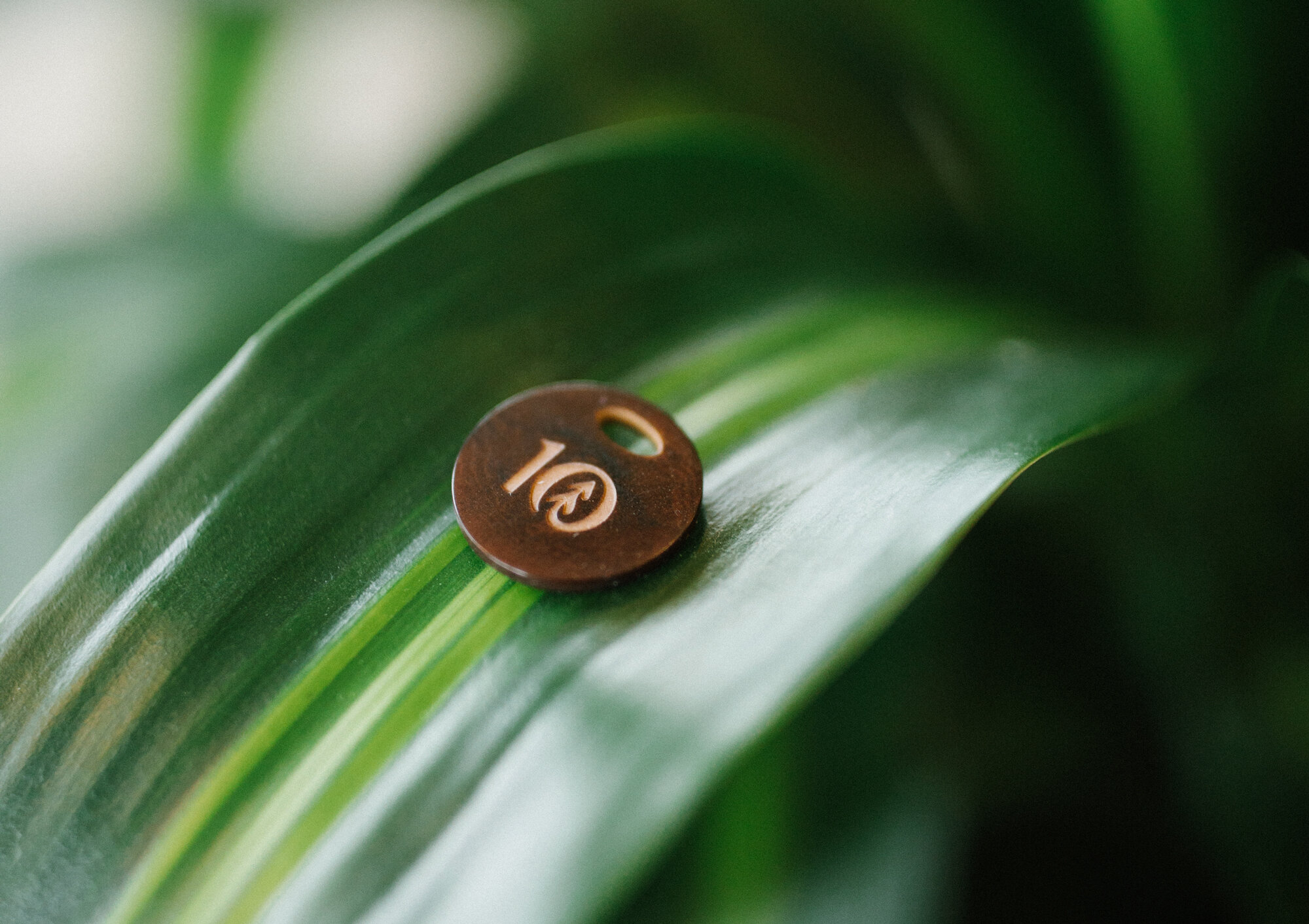
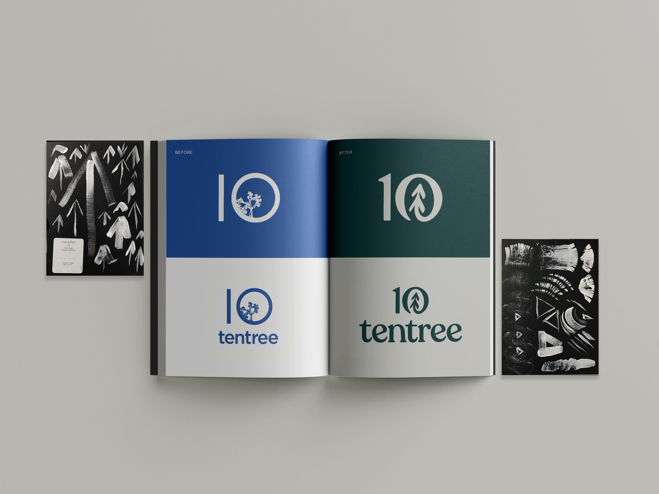
The new logo needed key elements from nature, so we took inspiration from a tree’s cycle of growth and the cycle of nature. The new logo utilizes the upward growth and the positive impact of trees. The zero embodies the constant circularity within nature and our drive for sustainability. Like a recycling symbol or mobius strip, it’s a constant cycle.
Logo and brand value
Logo
Icon in Motion

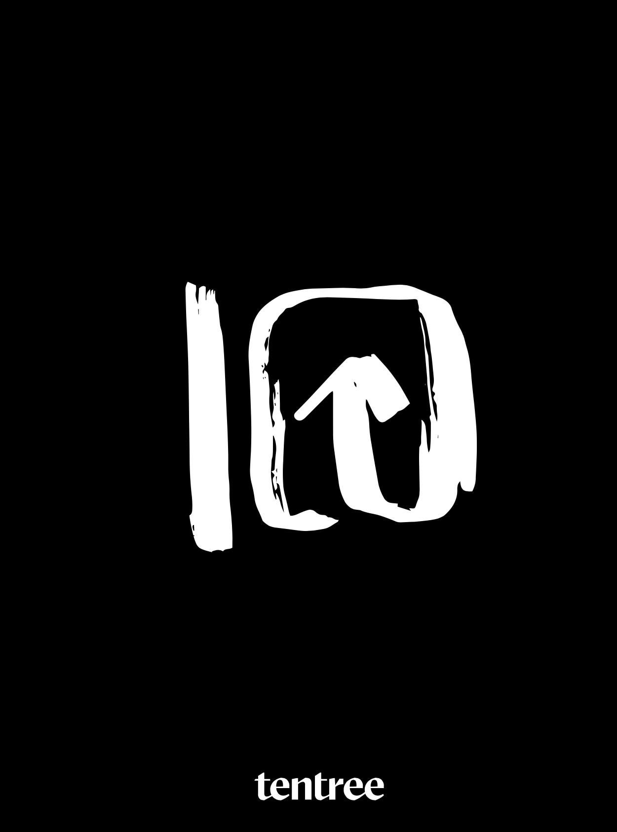
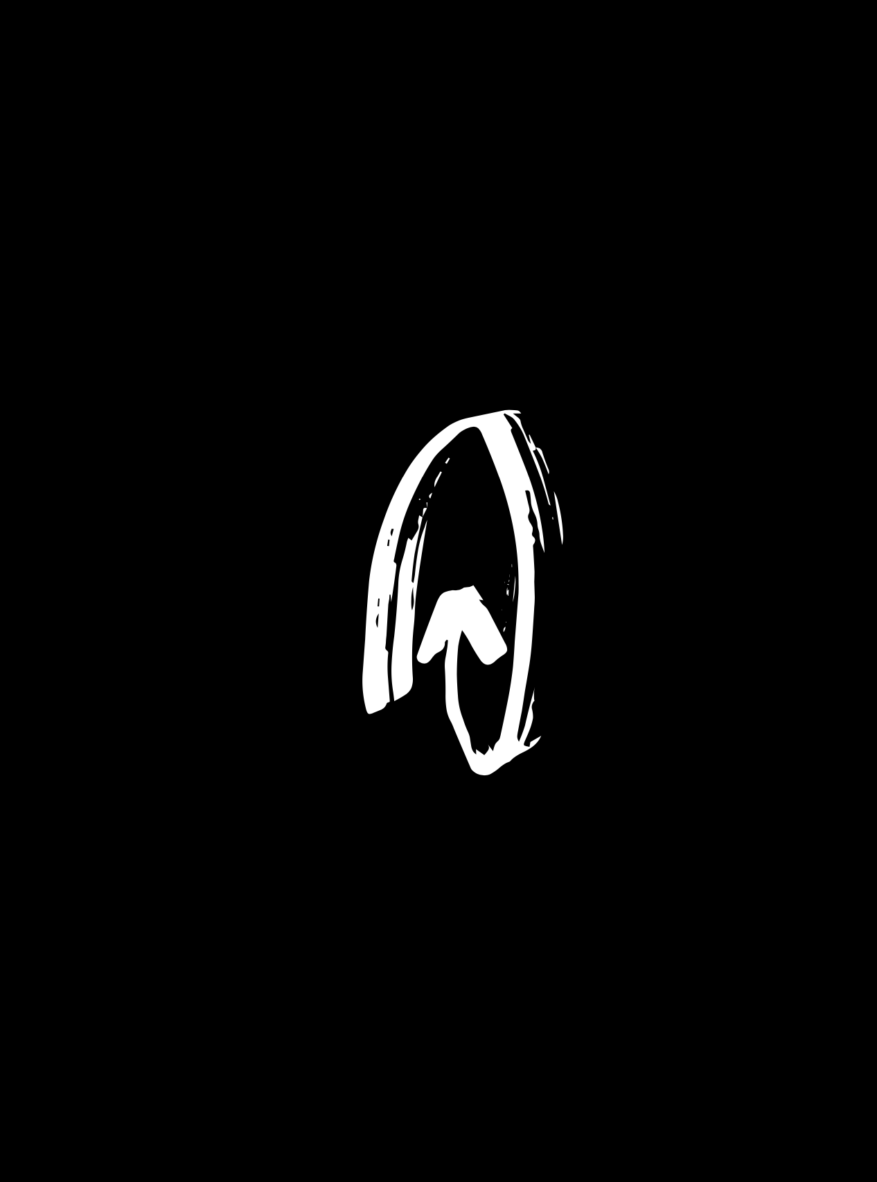
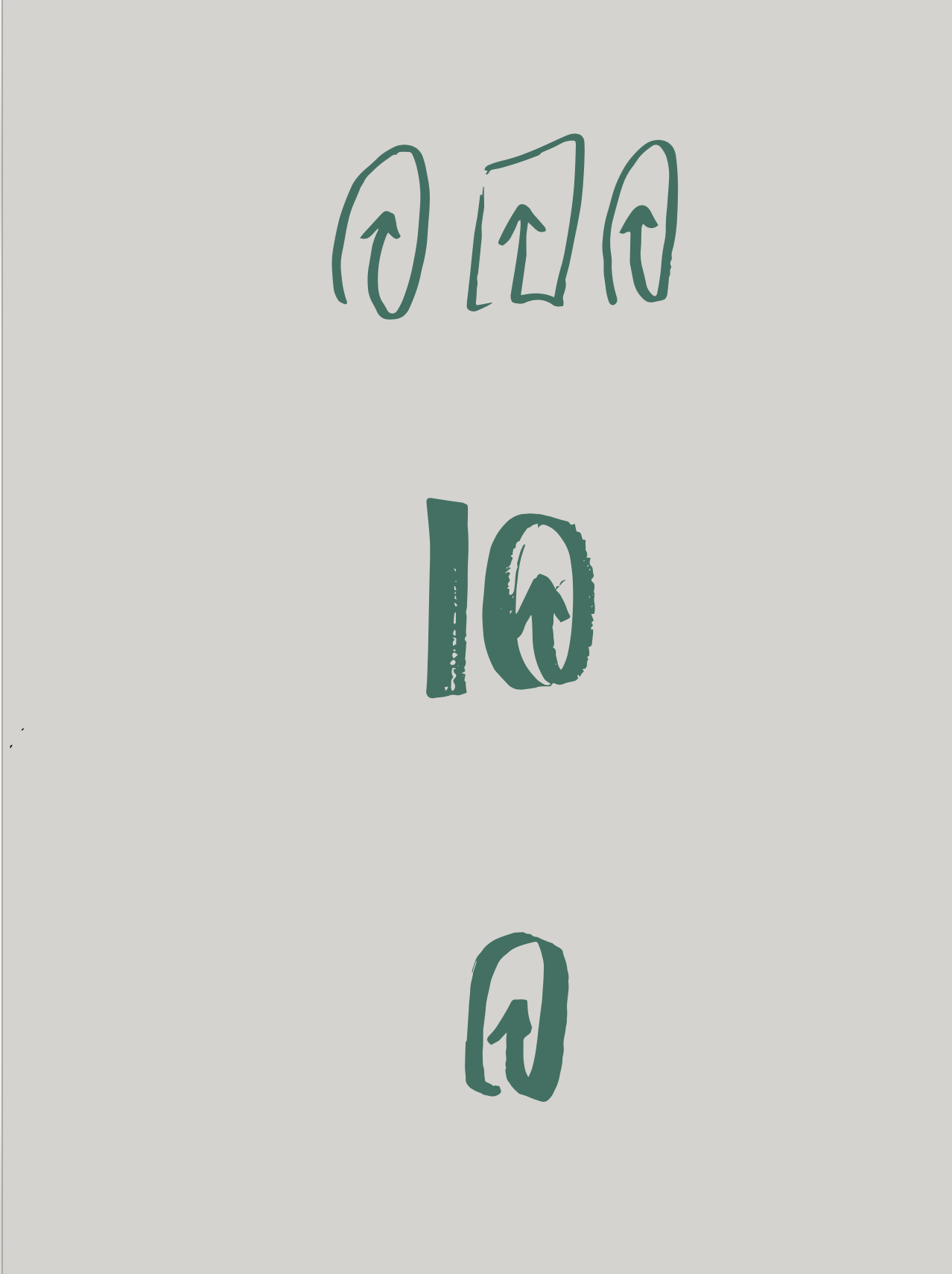
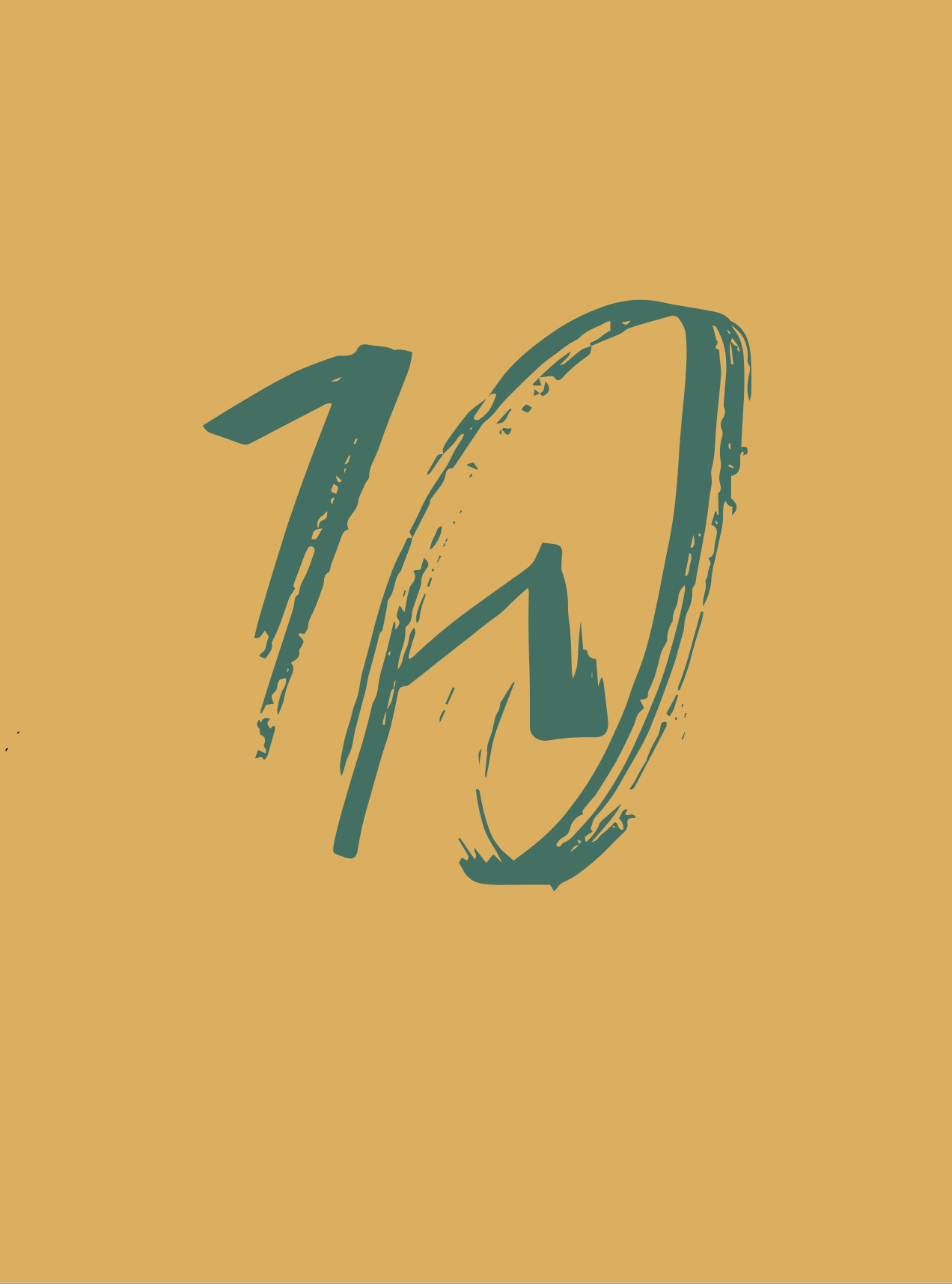
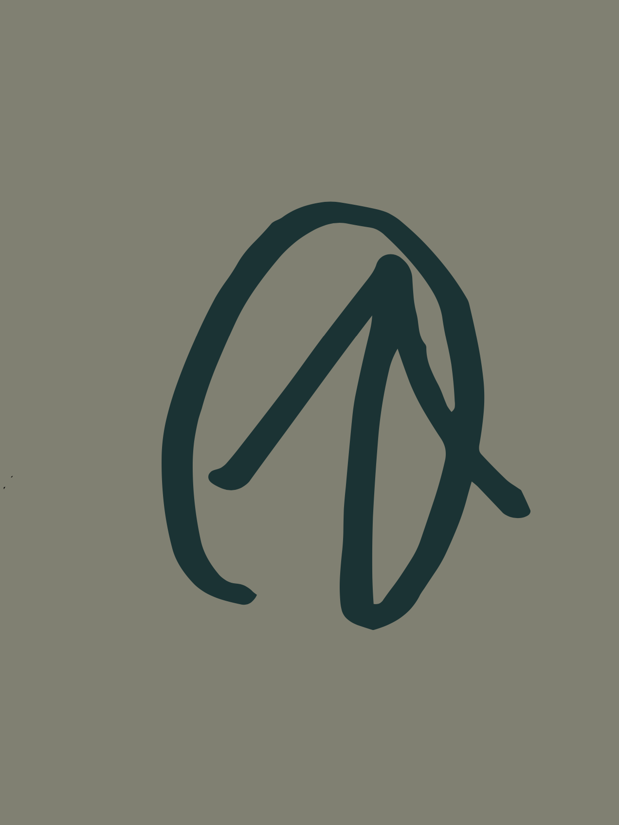
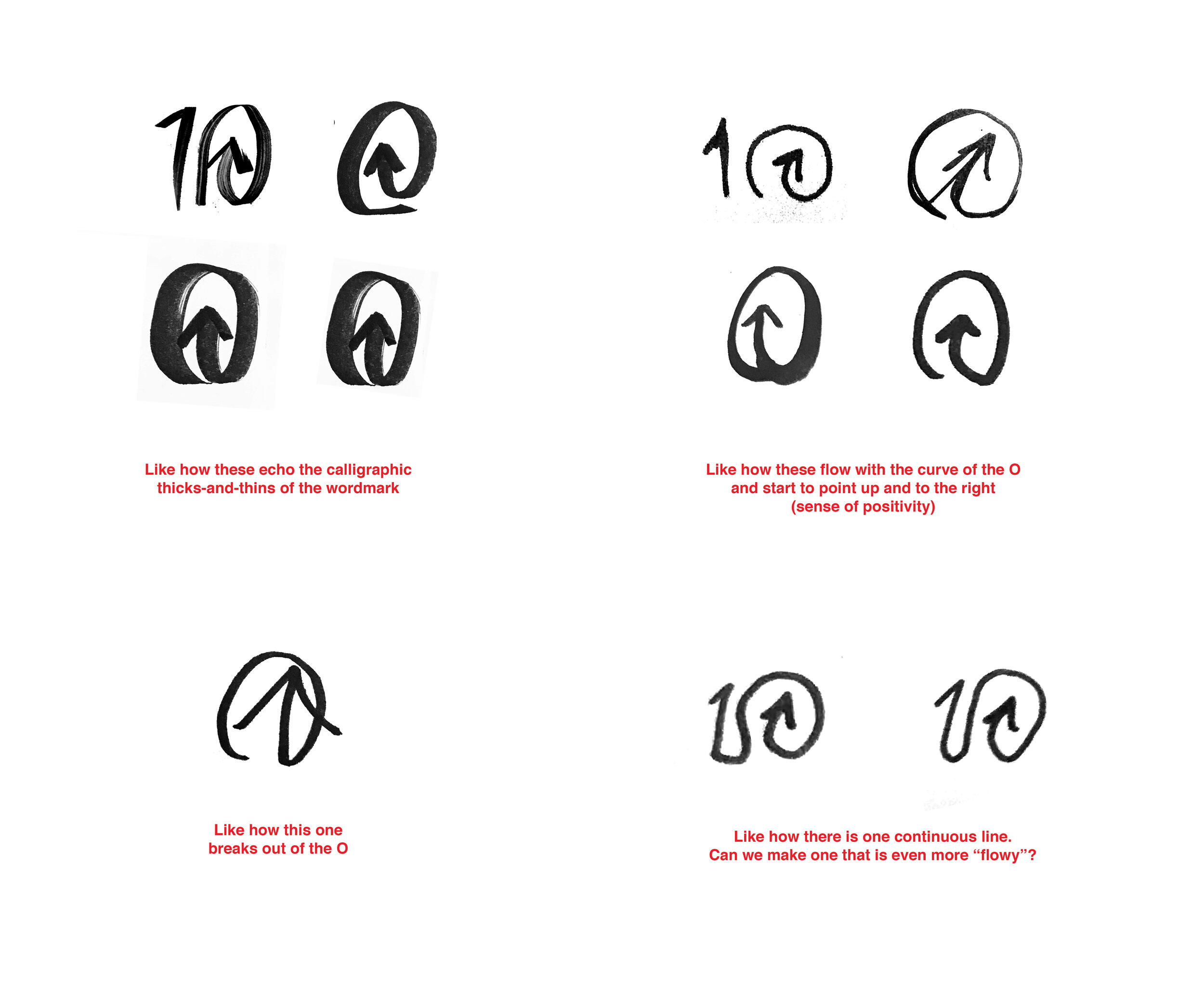
“The new “10” icon is lovely, with a great abstract drawing of a tree — instead of the very literal rendition of the old one — that has been craftily integrated into the zero. Looking at the icon up close, it’s a champion of bezier use… all the curves are smooth while maintaining an extremely pleasant and minimal wobbliness that gives the icon a lot of character.”
—Under Consideration
Colour & Type
Customized version of Recoleta, renamed “Reforesta” for Tentree.
We also presented a whole new font and colour palette. The main brand colours we chose were all inspired by colours in the world. These earthy hues that naturally paint our landscapes were used throughout the new branding. In terms of typography, we chose a font that was timeless and classic, but with distinct strokes. We wanted a look that customers would be proud and excited to wear.


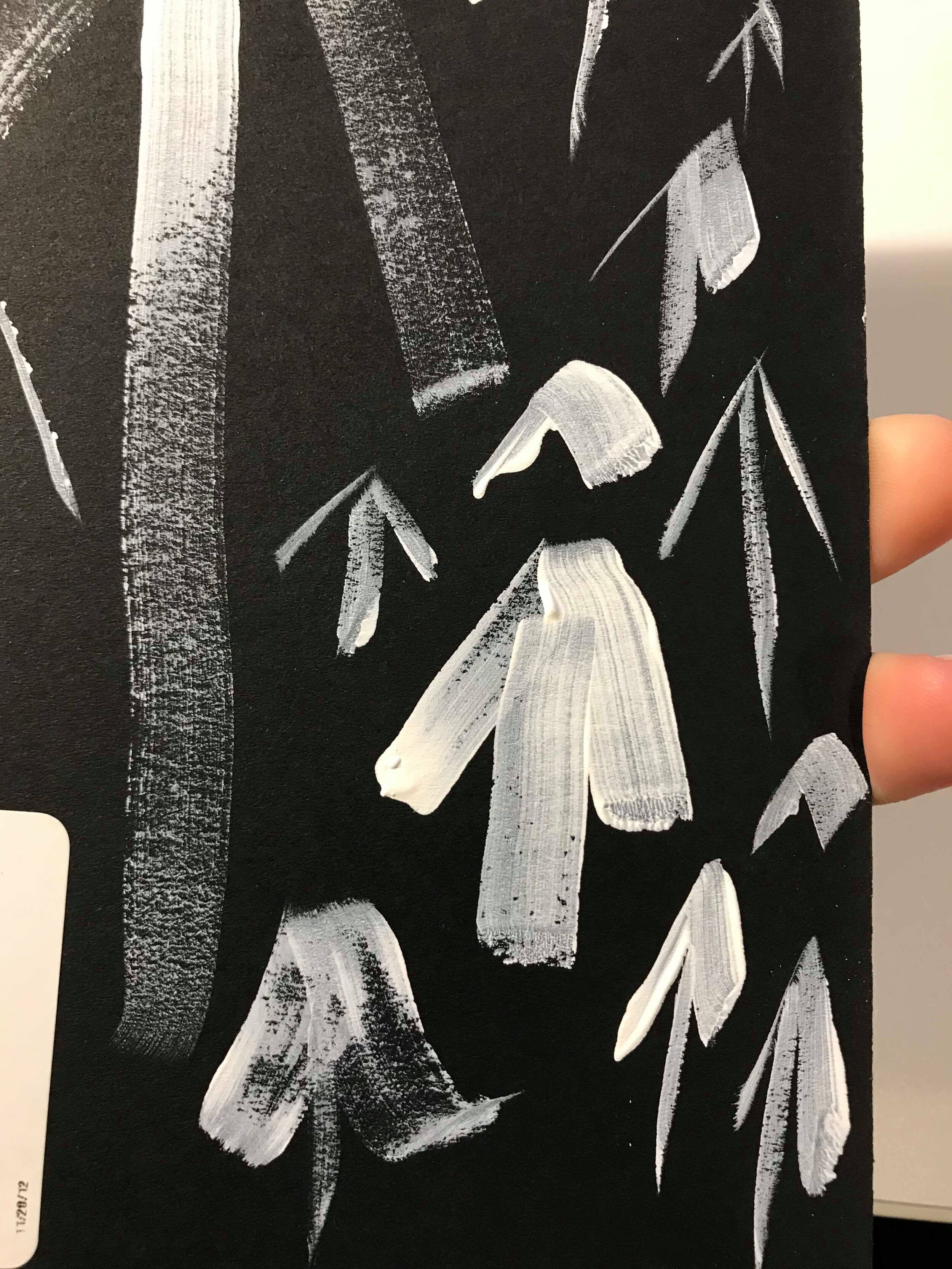
Tree font
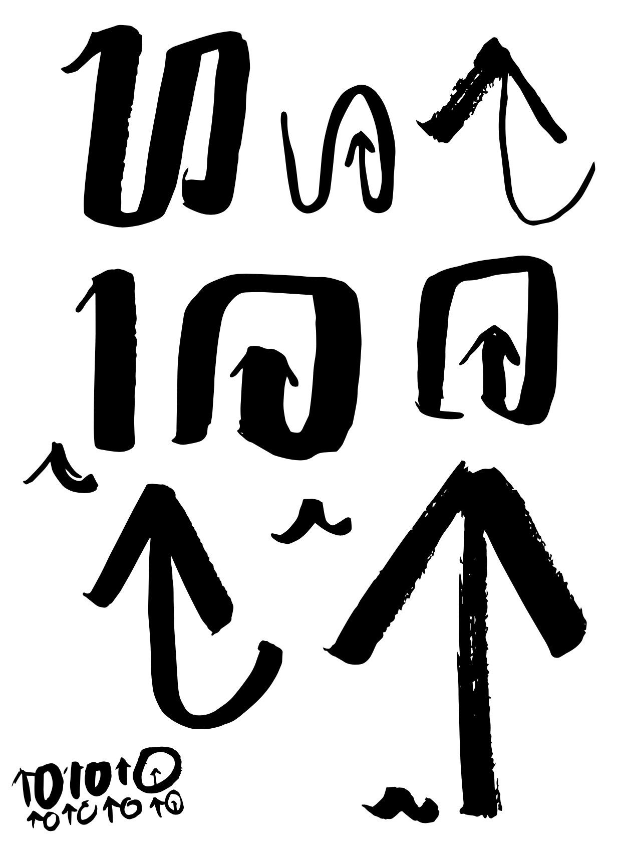
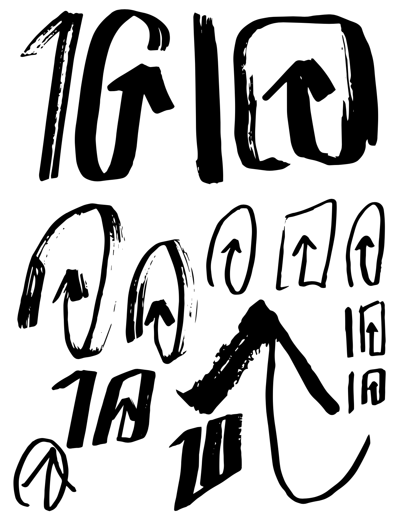
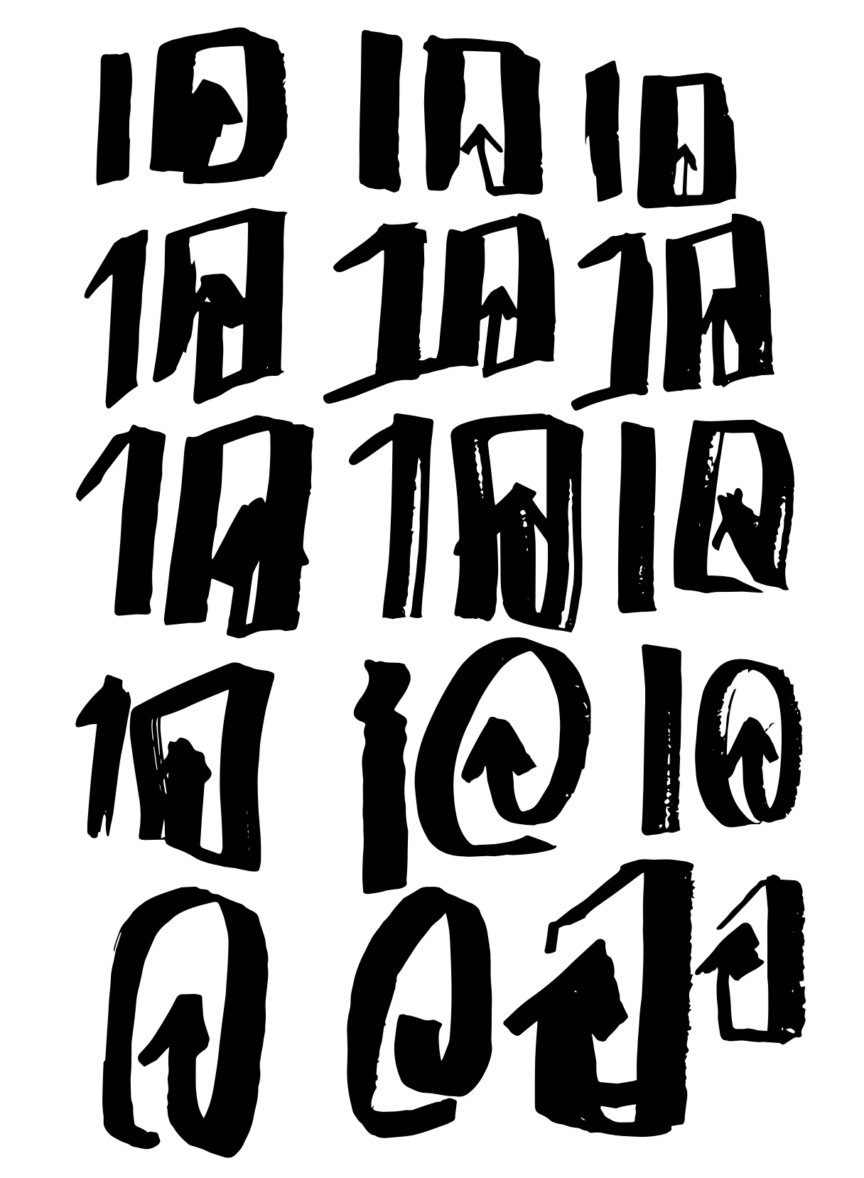
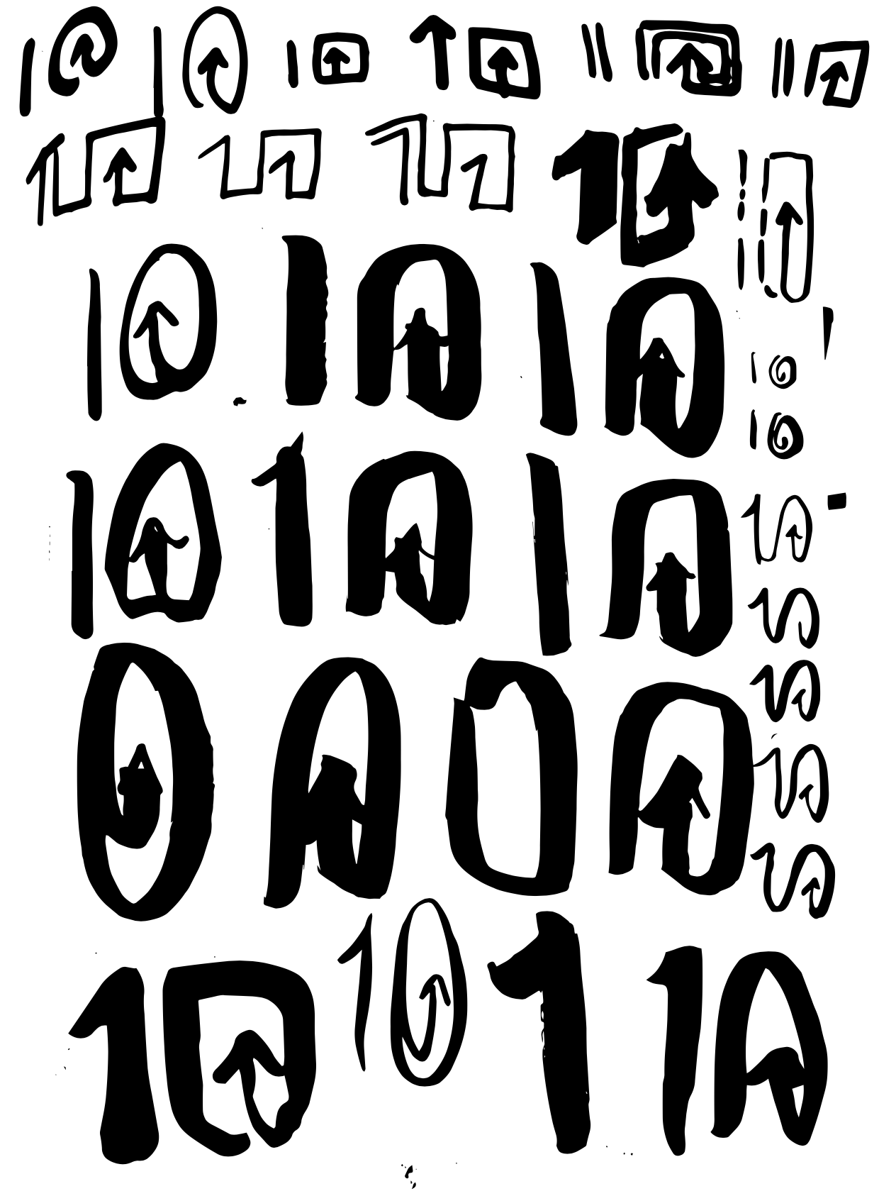
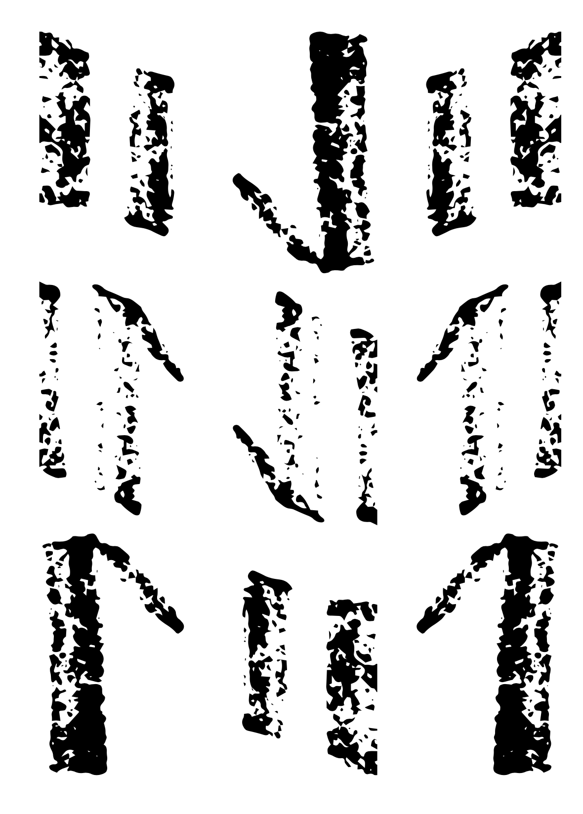
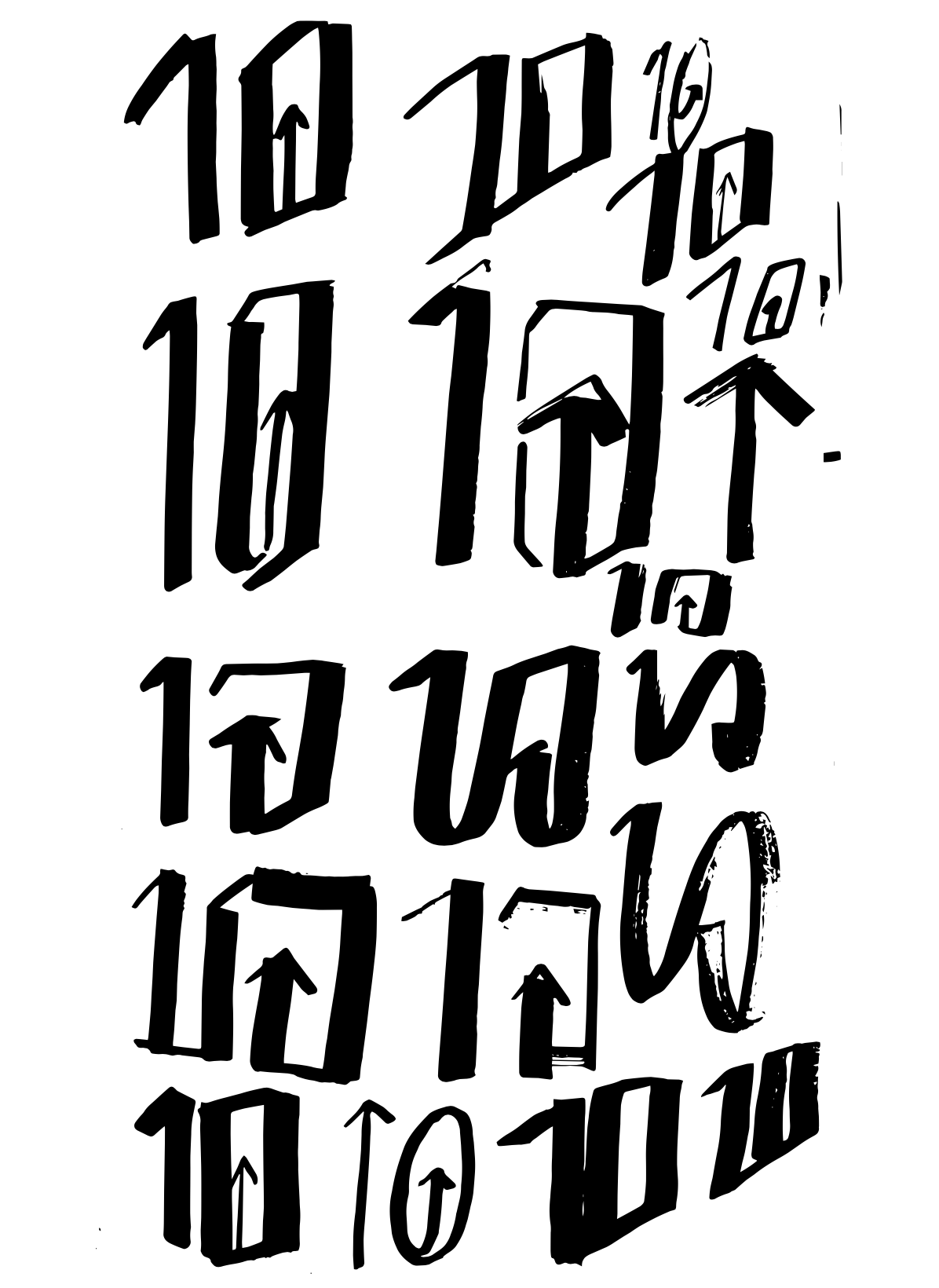
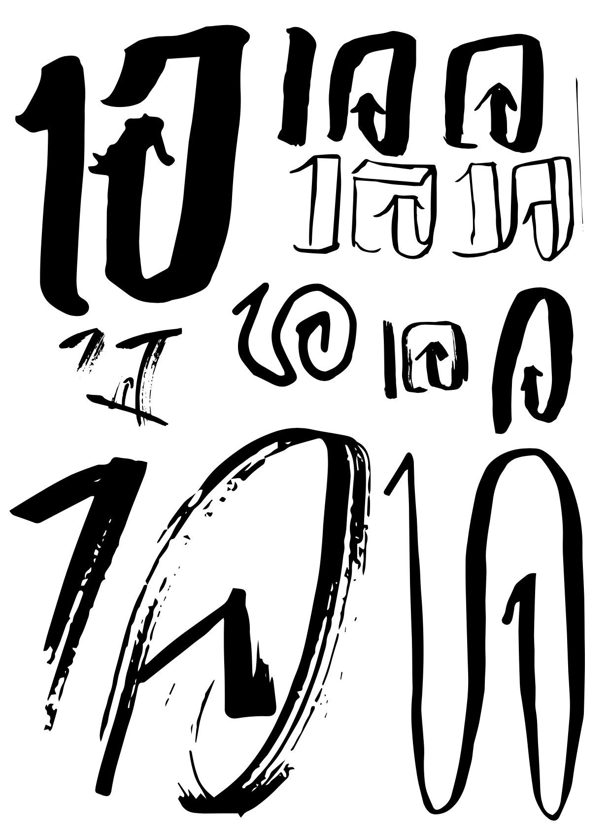
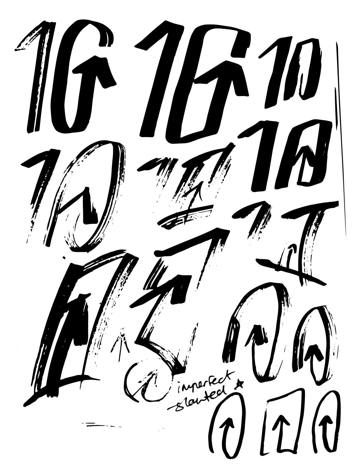
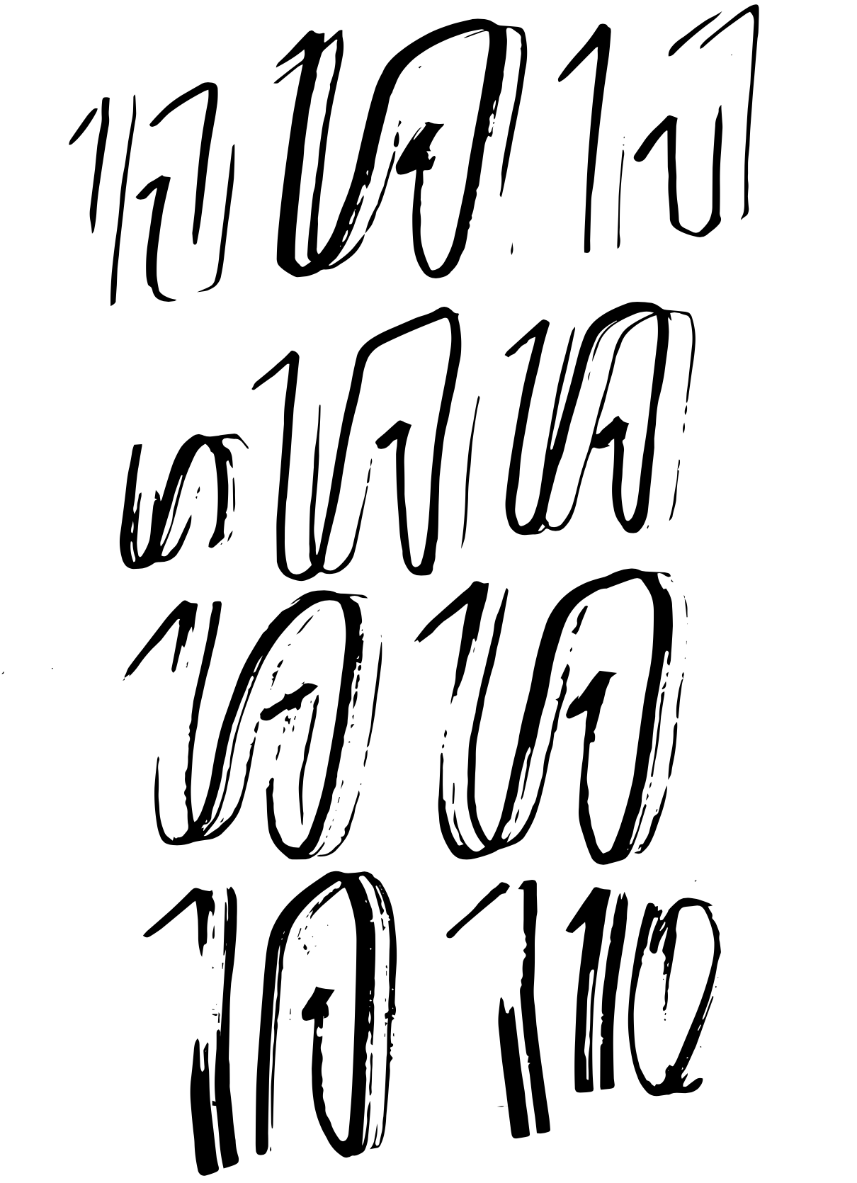
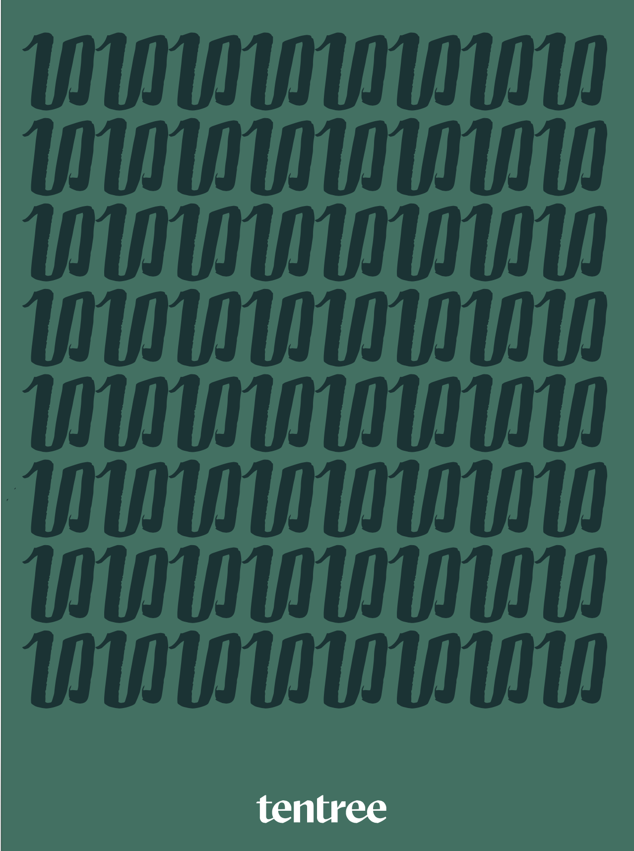
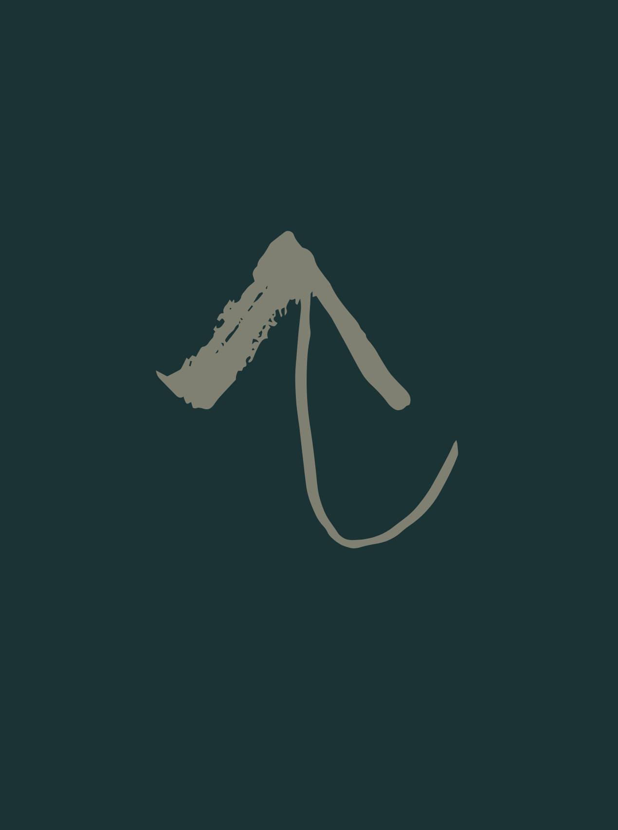
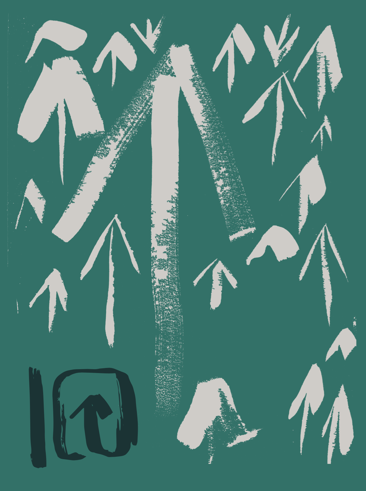
An additional element we discovered in our design process, was the potential to create a whole alphabet of trees out of the various arrow paintings I had explored on canvas. The brush stroke texture represented individual imperfections, the rustic outdoorsy lifestyle and also the rigour and passion that goes into planting trees.
Product
The visual identity came together beautifully.
“Starting with the aforementioned Chobani-esque typeface that is supported by an earthy colour palette that doesn’t feel cloying and a fun set of tree brush-stroke drawings built into a font for ease of use. These all come together very convincingly in application with the help of great photography and products that simply look good.”


