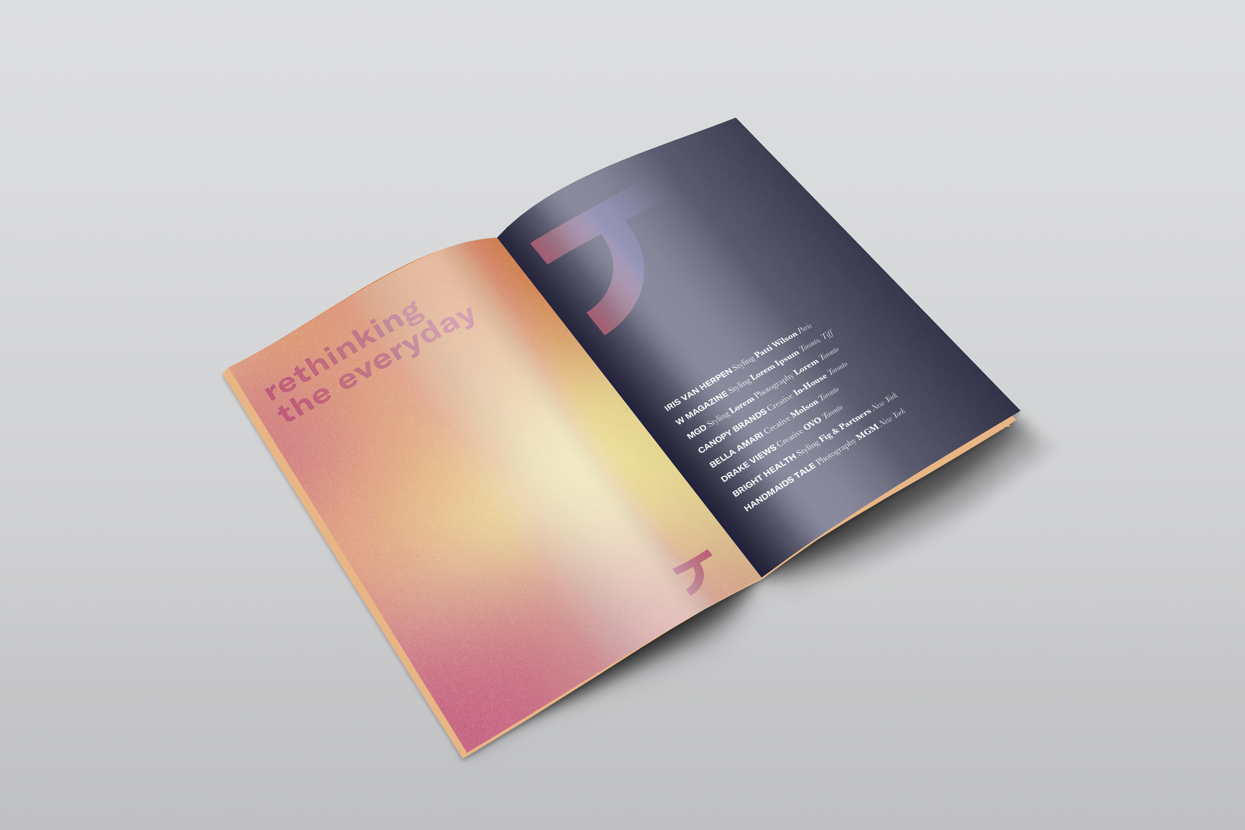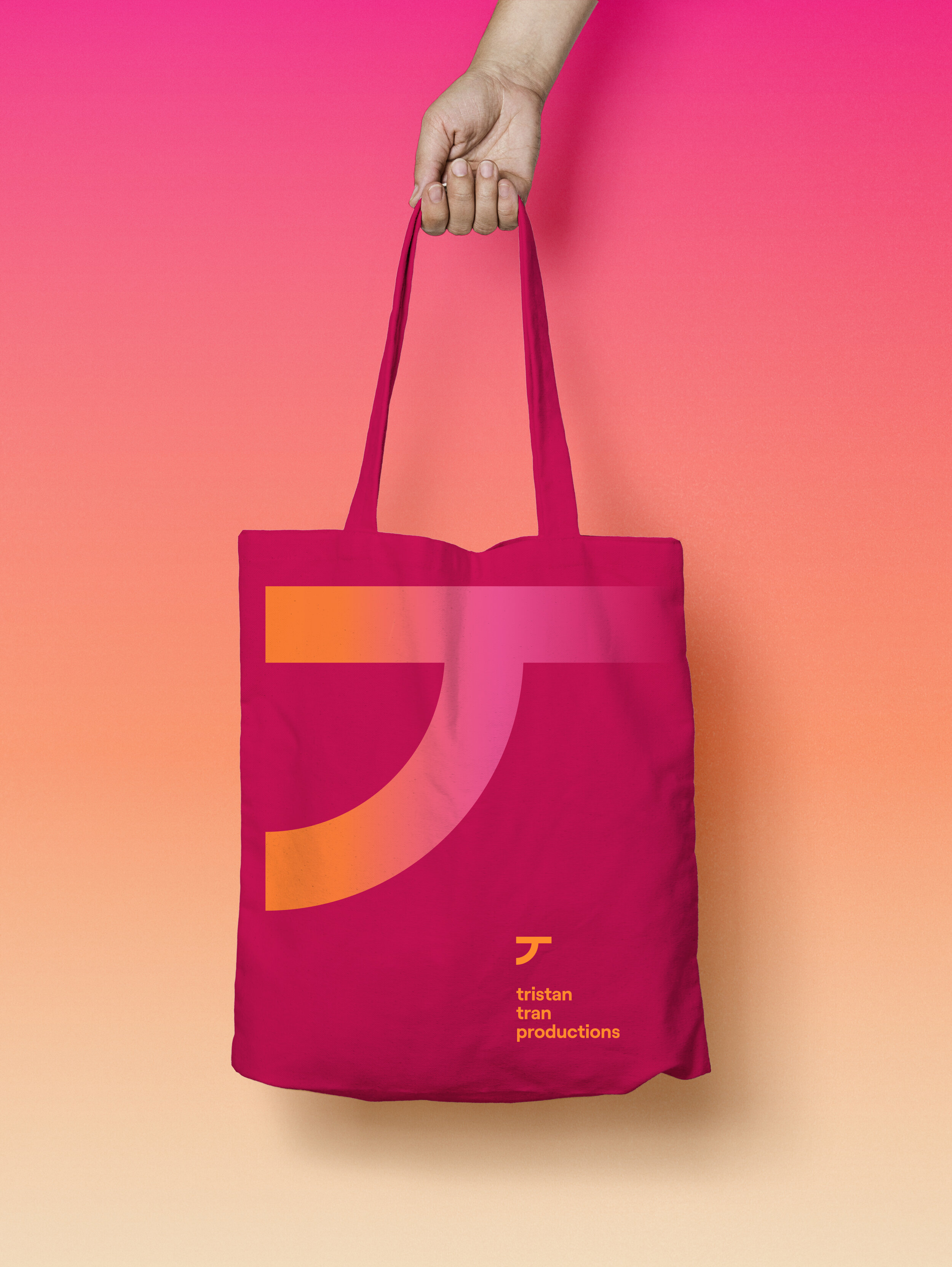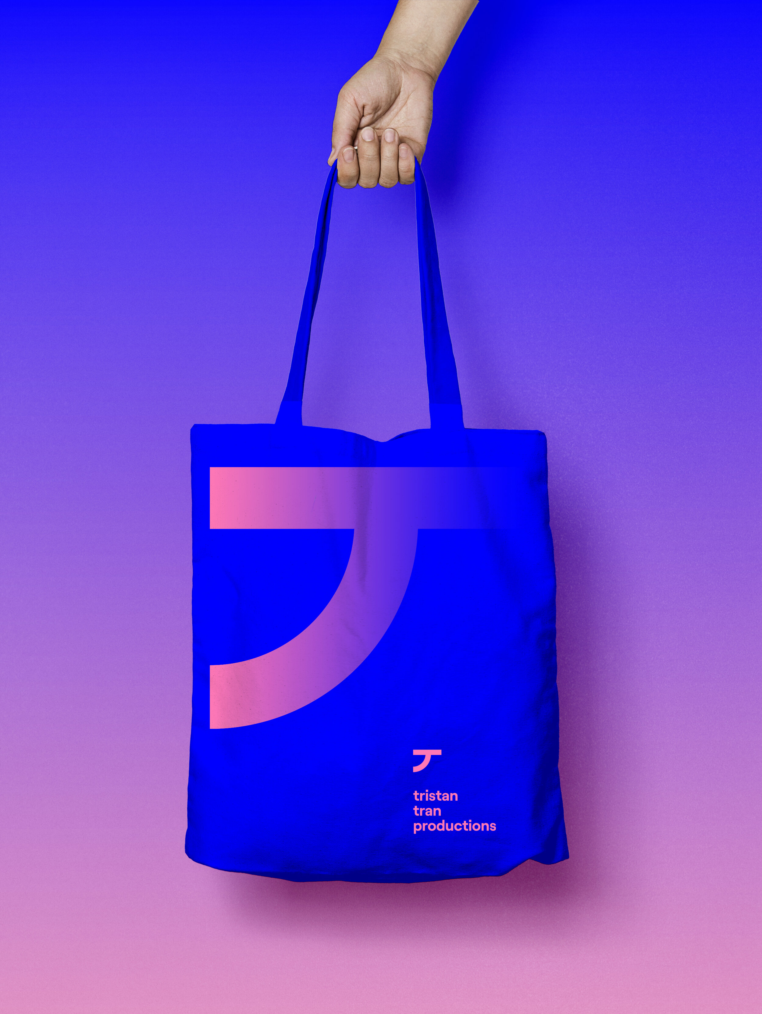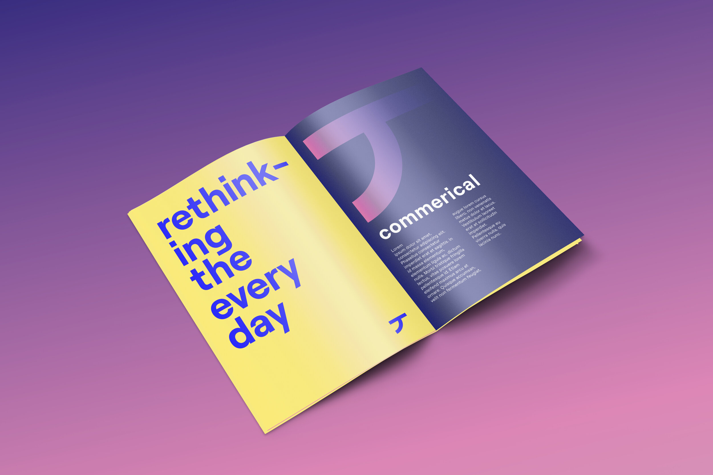
A transformational identity for an ever-evolving producer.
Priya Mistry, Designer | Matthew McKinnon, Web Developer, Coder
In collaboration with Tristan Tran
Tristan Tran from Tristan Tran Productions approached me for a complete revamp of the branding of his production house with the idea of transformation in mind. Inspired by a spectrum of muted gradients and a mood board full of Vietnamese typography, he wanted his brand to embody the mergence of his bicultural identity with his body of work he created with the at-most attention to detail.
Visual Identity
Logo
The TTP logo captures the character of our brand in a simple and ownable way. Inspired by calligraphy, the logo serves as a shorthand for a “T”, capturing both the human and architectural sides of the brand.
Colour
The TTP palette is pulled from colours found in a series of vibrant gradients. The palette ranging from brights to darks, is energetic and modern.
Type
Primary Typeface: GT America Extended Medium is used for Headlines and bold is used for emphasis.
Secondary Typeface: Baskerville Regular is used for body copy and bold and italics are used for emphasis. Follow the Tracking, Leading, Case & Alignment specs indicated below.
Typography
Gradient Logo “T” on Colour
Logo & Wordmark
Colour Palette
Colour Palette
Gradient Colour Palette
Website
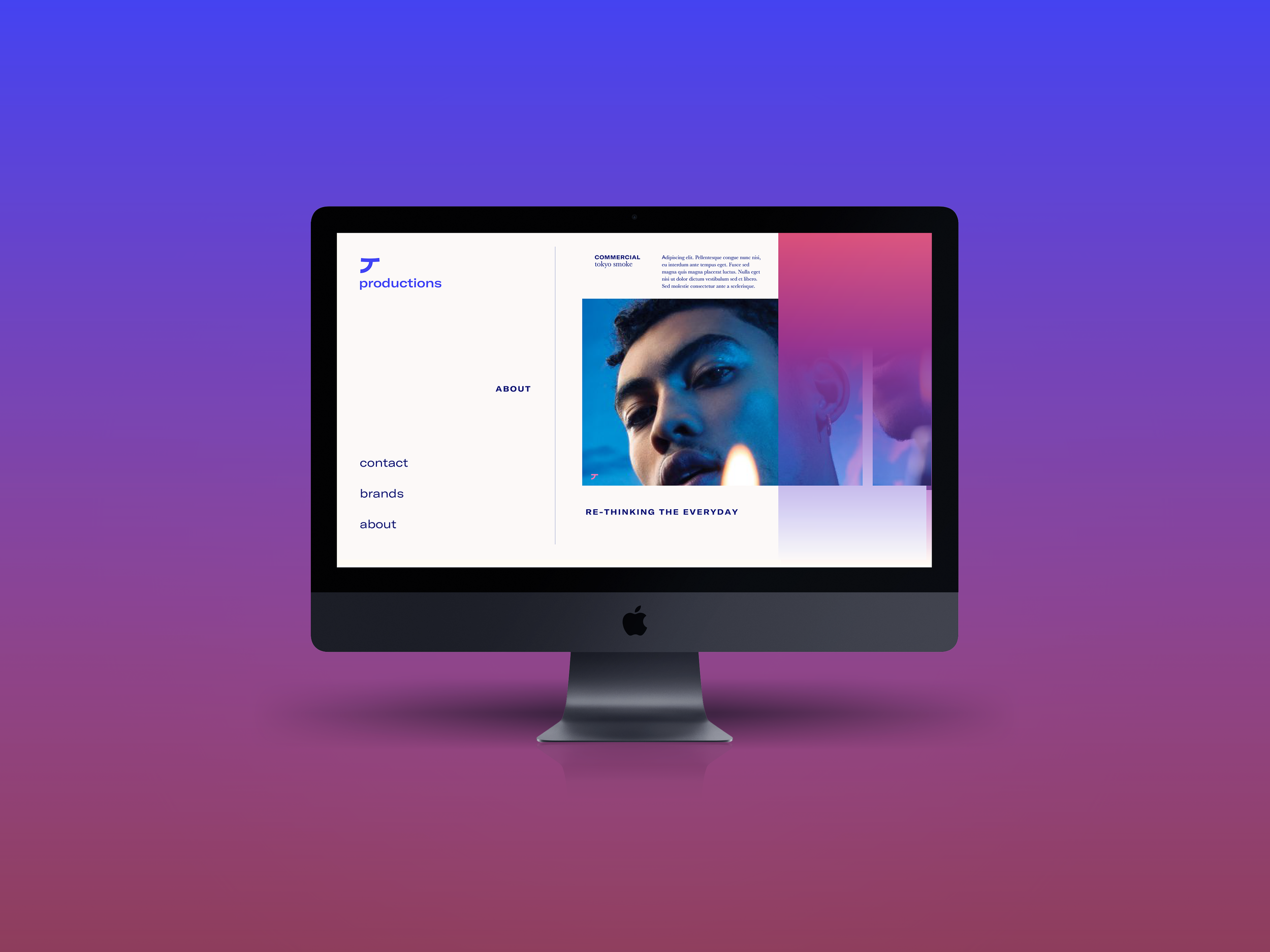
TTP Homepage
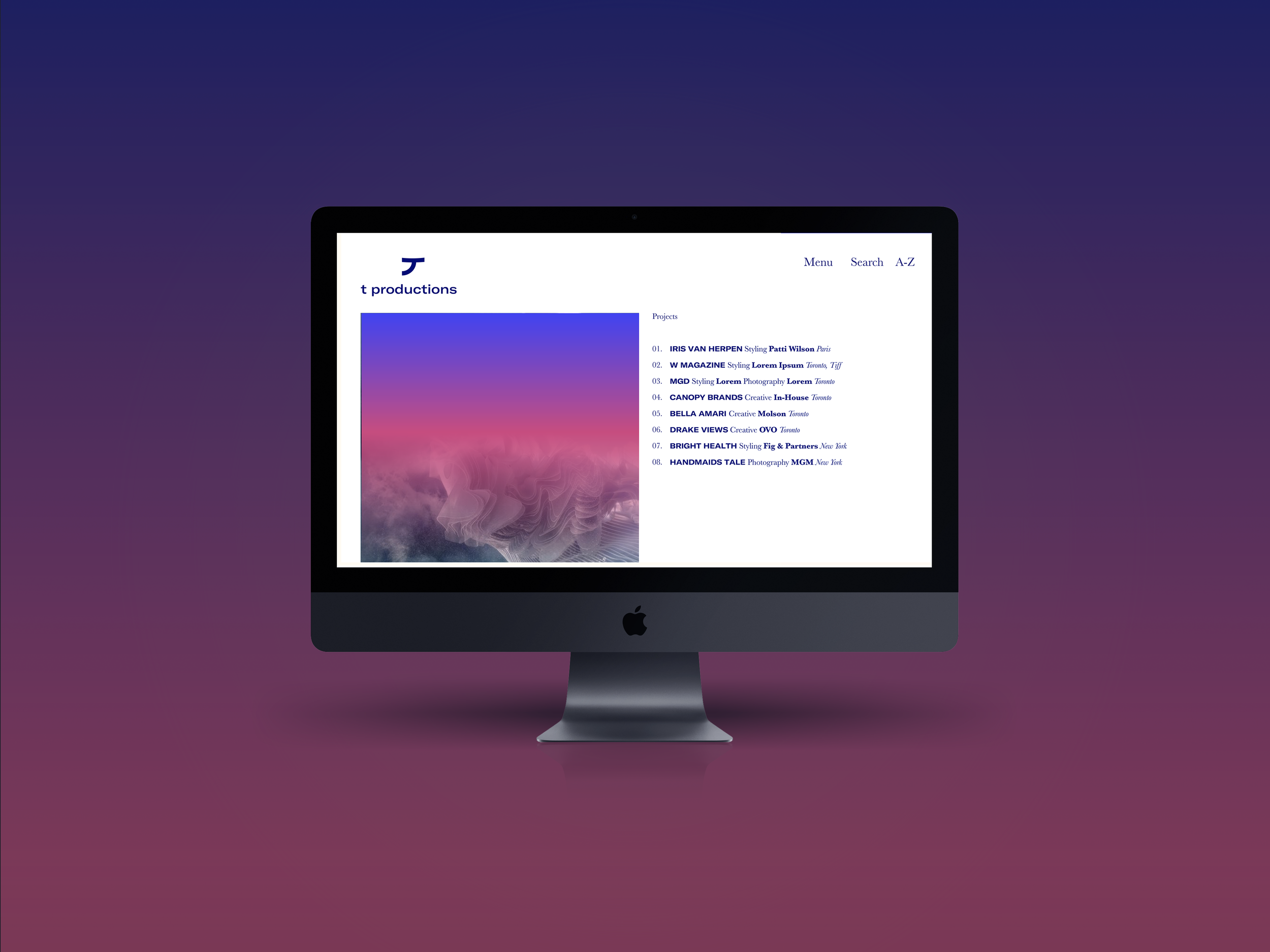
TTP Project Scroll

TTP Intro Coverpage

TTP Hover Project Scroll
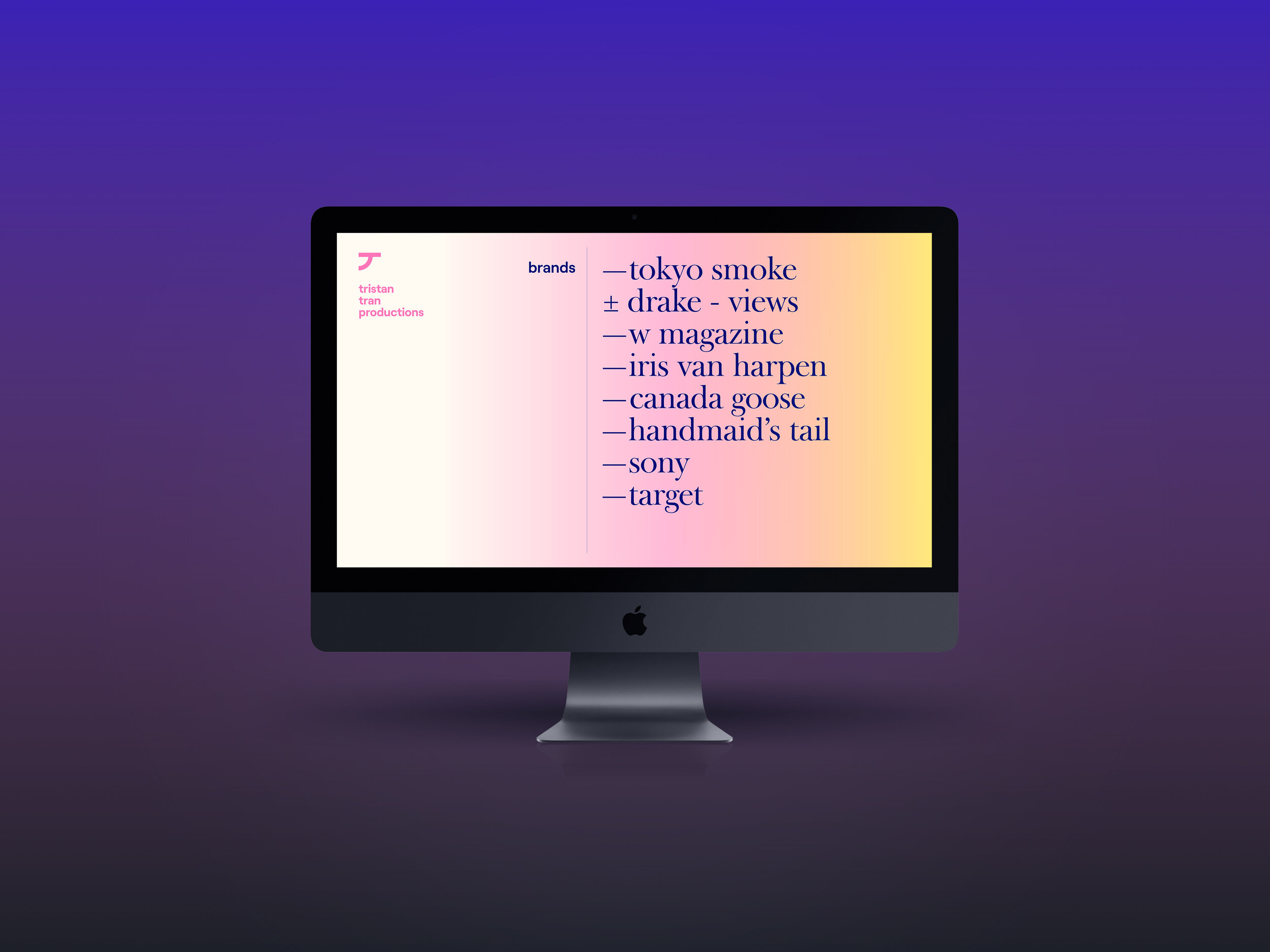
TTP Gradient Transition
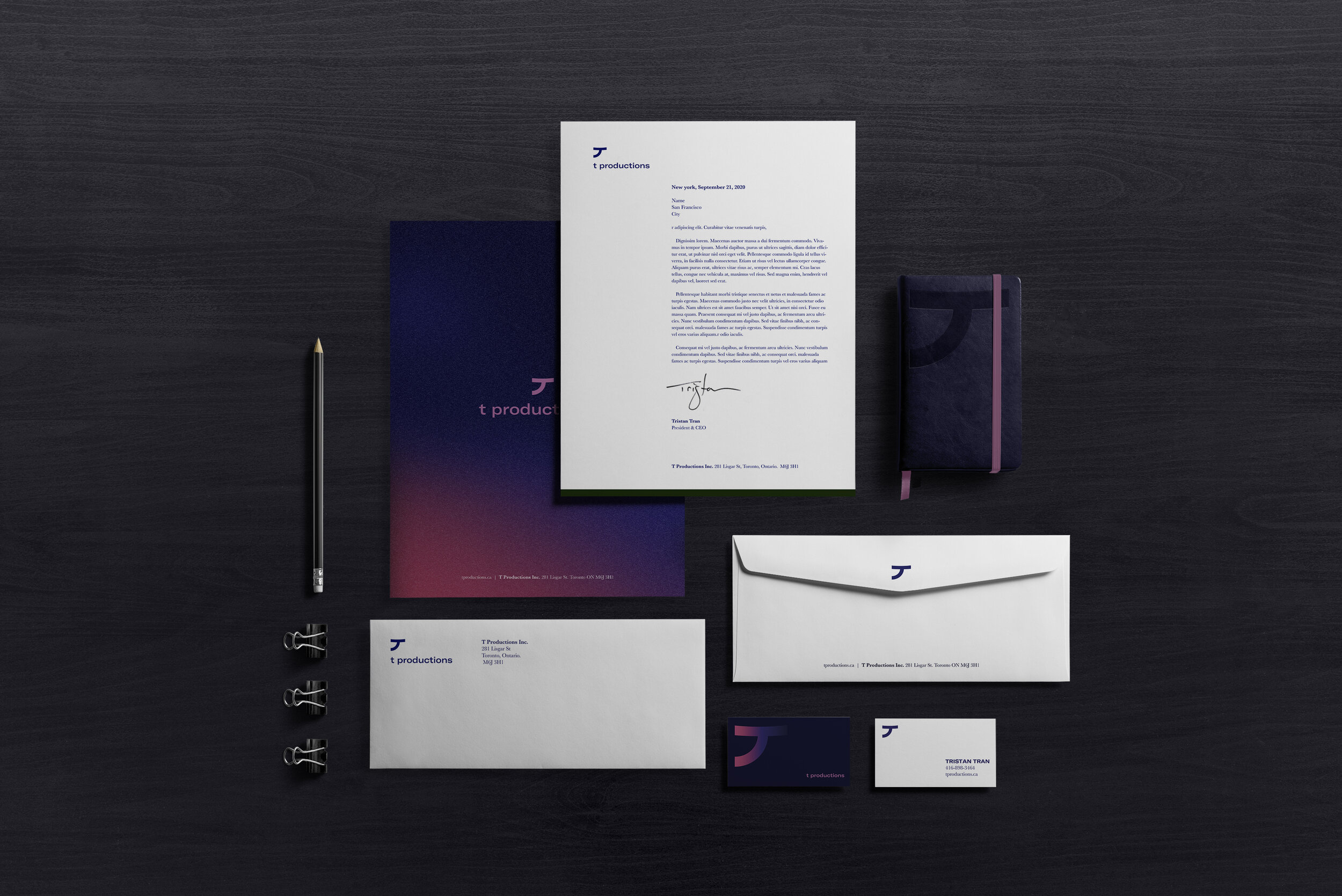
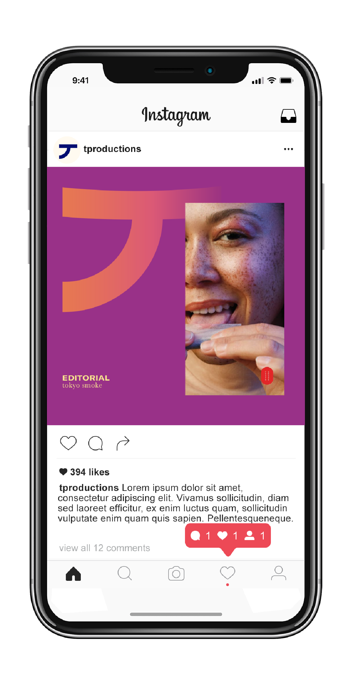
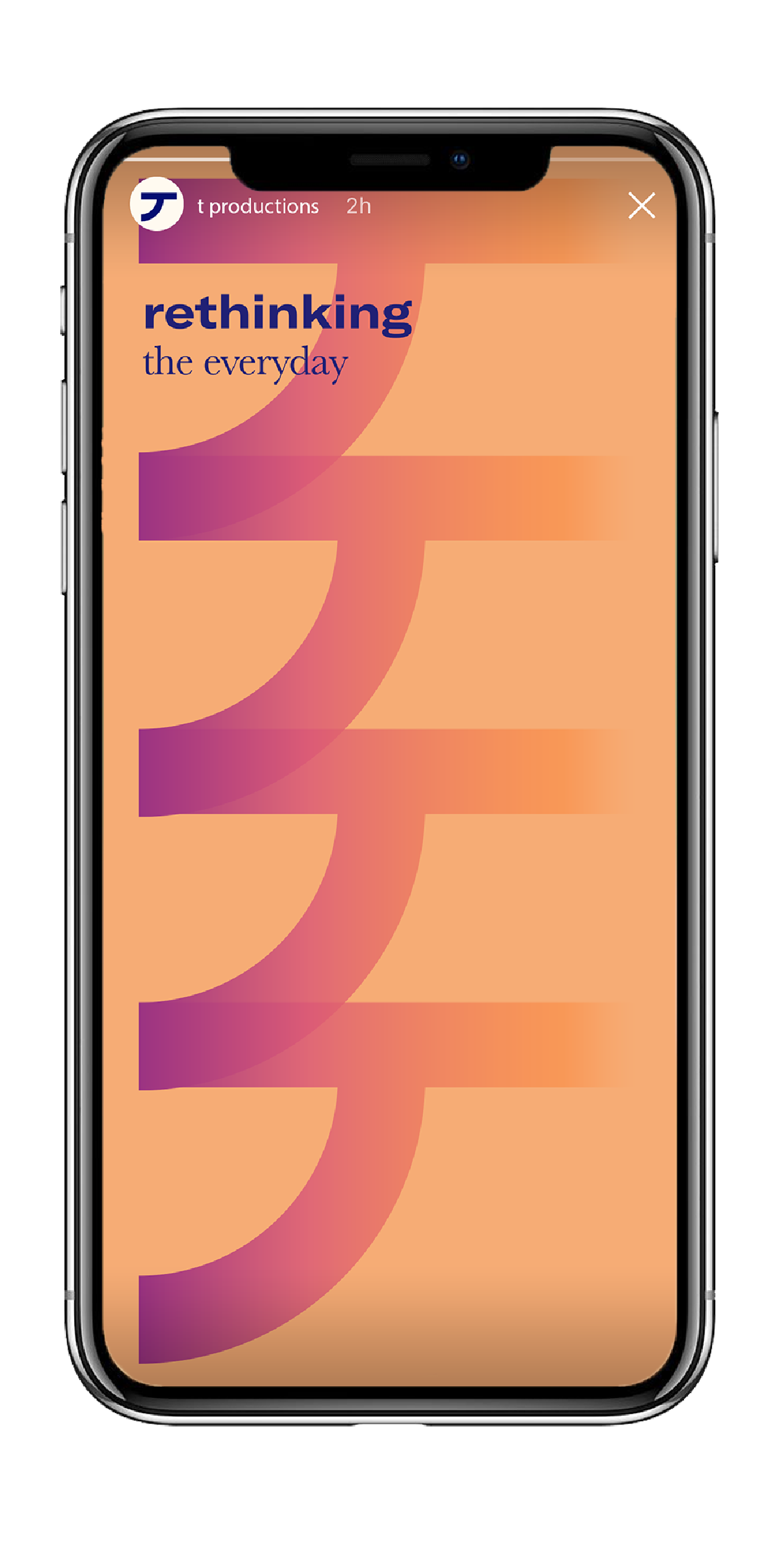
Social


Inspiration

