Priya Mistry, Designer & Art Direction | Sasha Barkans, Art Director | Cristina Pineros, Copywriter
Matt Fraracci, Creative Director | Soleil Denault, Director | Andre Turpin , DP
Molson Coors Beverage Co. launched Aquarelle in 2019 with hopes that it would take the nation by storm. Unfortunately their can design lacked simplicity and character resulting in them almost losing their shelf spot at LCBO. They approached us for a complete rebrand which was both exciting and an opportunity to shift perspectives in the market. We relaunched Aquarelle as a national advertising campaign that encouraged Canadians to embrace their true selves, whoever that may be.
Led by a colourful, 30-second spot entitled “Flavour the Ordinary,” art directed and shot all by working from home during COVID-19, the cross-platform campaign showcased real people captured in their own element, along with Aquarelle’s array of flavours and combined traditional advertising with messages from influencers in the LGBTQ community.
Awards & Recognition
TV: Flavour the Ordinary
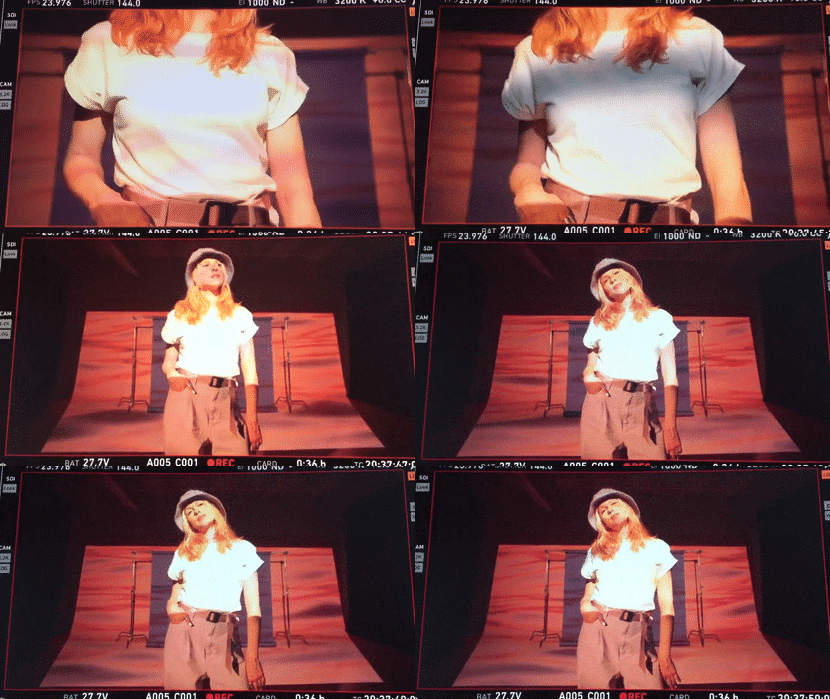
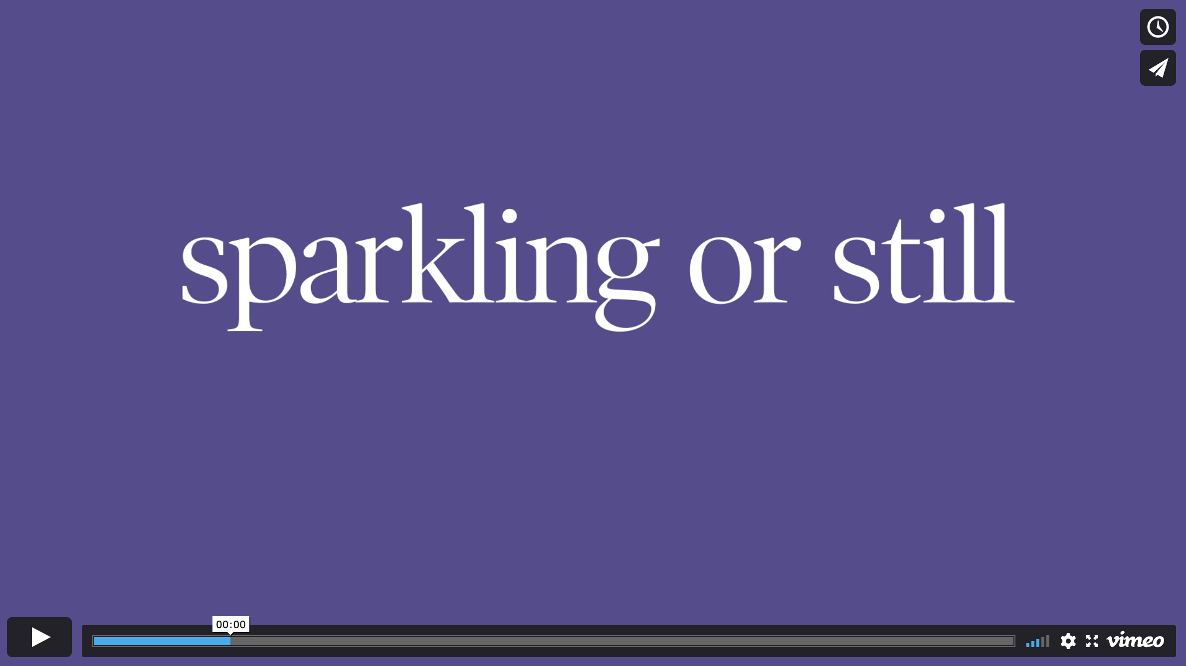
Our colorful 30-second spot entitled “Flavour the Ordinary,” took Canada by storm. Aquarelle was all about embracing realness and celebrating individual flavour and so we did just that, featured dancers, creatives and influencers in a happy, beautifully composed spot which collaged together kinetic typography, 3D renders and animations of the cans and shot video footage.
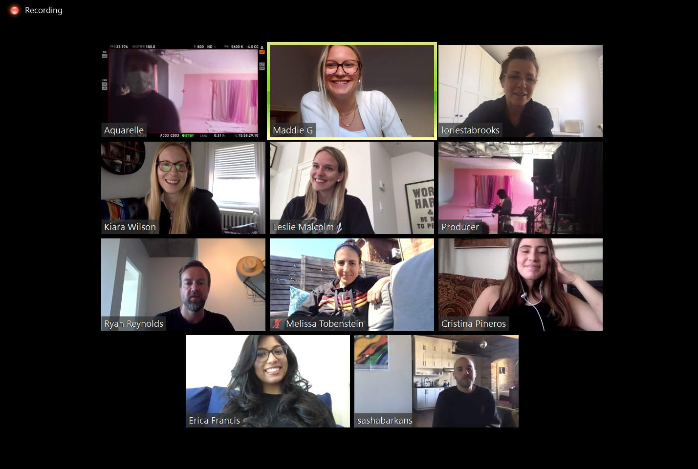
With the coronavirus pandemic and stay-at-home orders disrupting businesses across the globe, the spot was shot on location in Montreal with minimal on-set personnel and much of the Aquarelle creative team observing remotely. Despite those hurdles, the final product met even pre-pandemic expectations: “You would not imagine this was filmed with any restrictions,” Maddie Gillmeister (Marketing Manager, Aquarelle).
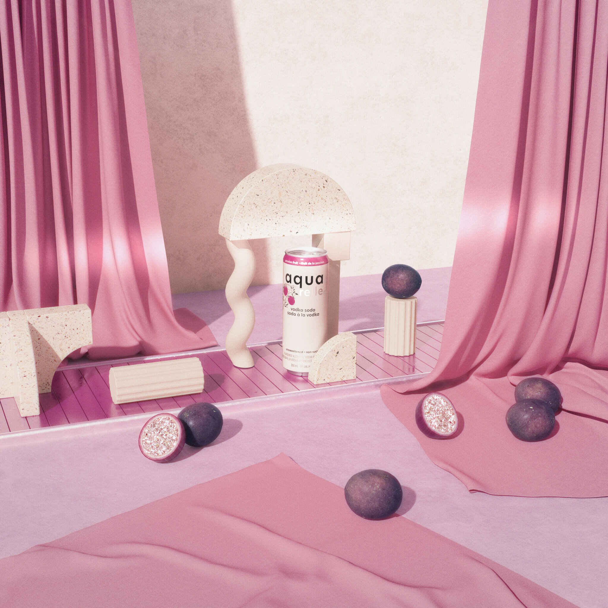
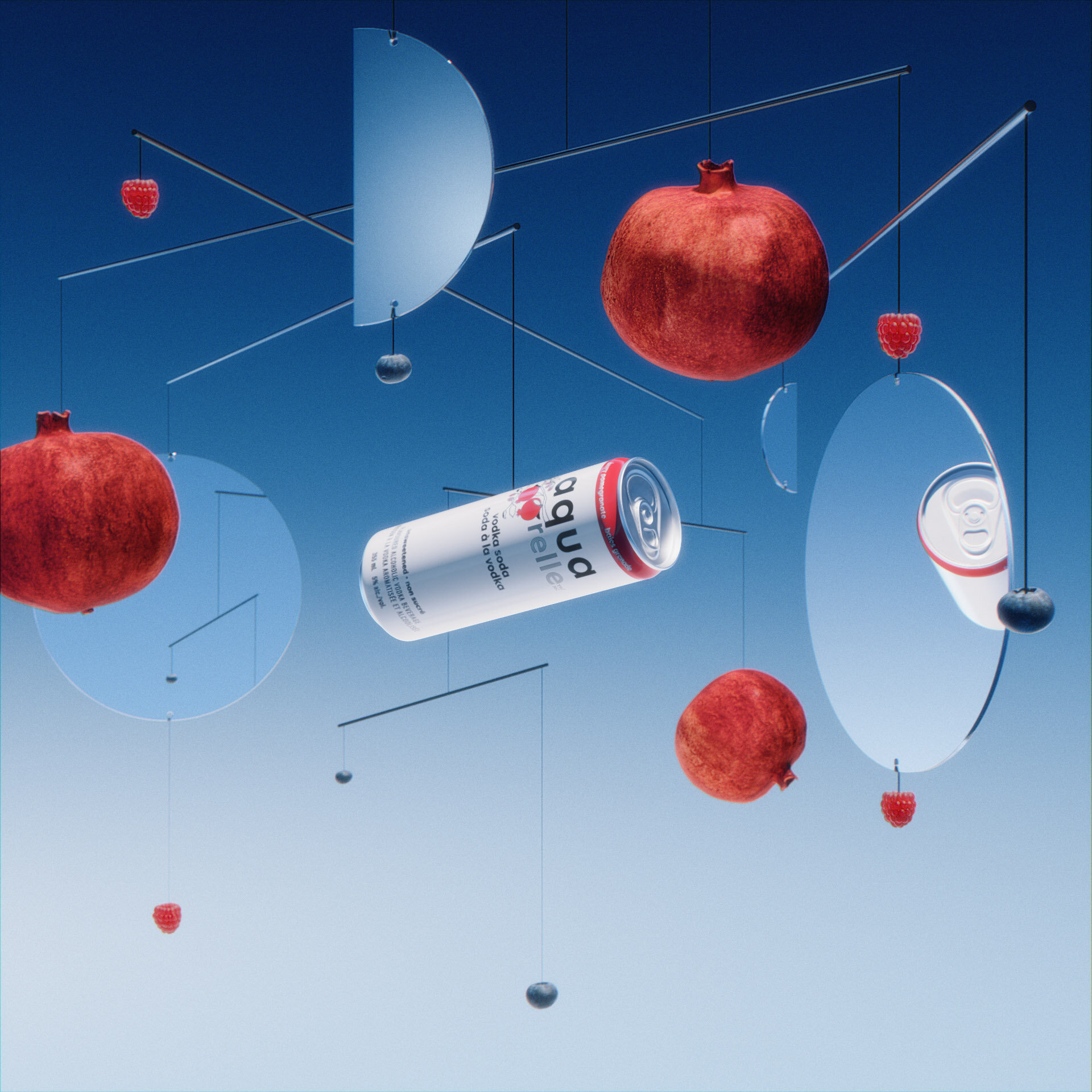
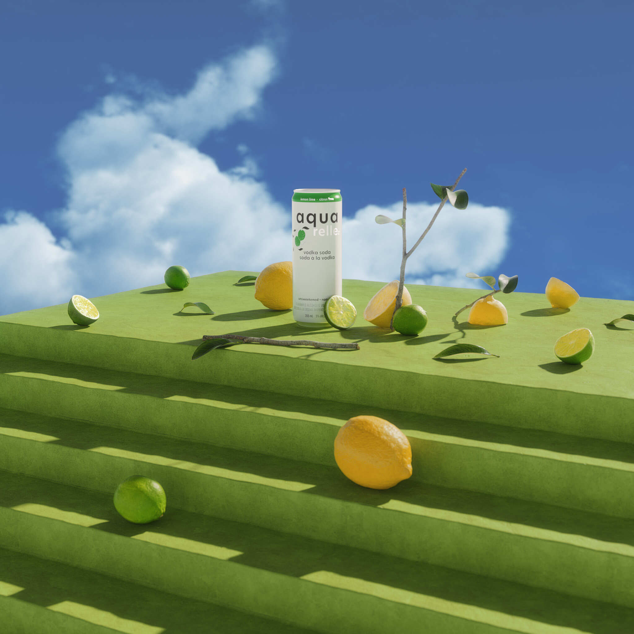

Embrace Realness
Art Direction
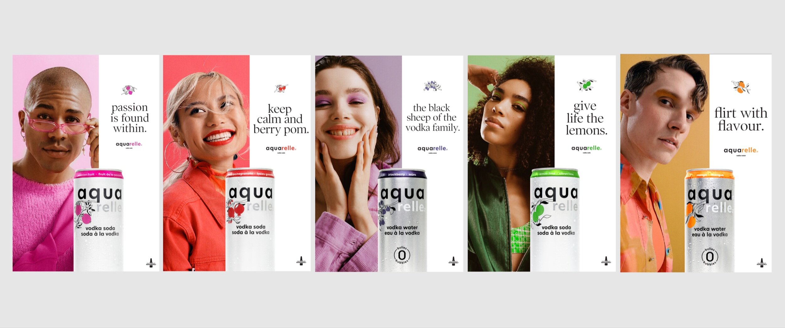
Aquarelle: A canvas that invites you to make it your own. Aquarelle was introduced as being witty, expressive and empowering. To further push this narrative, I wanted to capture a set of confident portraits, showcasing people who kept it real and never held back. With a tone on tone design system established for the creative, each model represented a flavour of Aquarelle.
I assigned each model a colour and then asked them to bring in their own touch of that colour to their portrait. Whether it was wearing their own earring or choosing a bold purple eye that they just loved, I wanted to give my models the opportunity to make it their own and truly feel comfortable in their own skin.
Photographer: Leeor Wilde
Visual Elements
Logo
Aquarelle’s logo was redesigned for a cleaner, more legible and direct presence on shelf. All the attention was to go to the new addition of fruit illustrations per flavour.
Colour
I created a vibrant and bold colour palette sampled from the various flavours. This unapologetic family of colours was then paired with muted tones of the same colour. Together, the combination of bright colours and their muted tones, brought energy to the creative and brought to life individual worlds for each flavour to exist in.
Illustration
We worked with local Toronto illustrator Jennifer Ilett to design fruit illustrations for each flavour to be featured on the can. We wanted them to feel organic, human, whimsical and fresh. It was important to make sure the fruit was reading clearly, but also that it was simple enough to be translated on an aluminum can. Jen created berry pomegranate, raspberries, mango, lemon-lime and grapefruit illustrations for the brand visual platform.
Typography
I wanted to introduce a typeface that felt approachable and light, but still had human moments within it. Since Aquarelle wanted to appeal to a more mature demographic of drinkers, I used Poynter Display to create a visual world that felt warm and energetic but still emotional and sophisticated.
Layouts
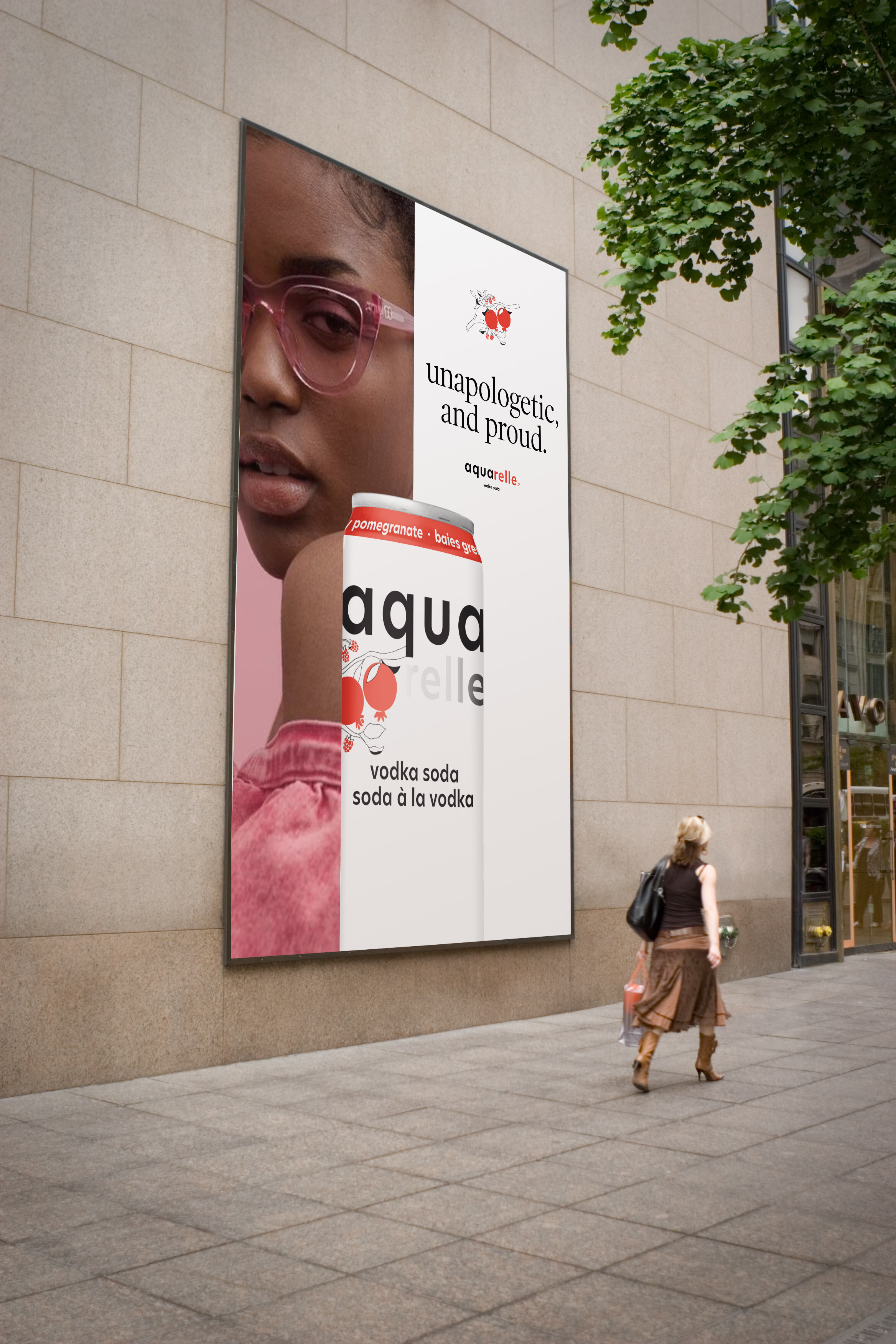
A gridded system was designed for multiple contextual layouts. I used a split-screen method to pair the flavour’s portrait with the can, along with it’s corresponding illustration and coloured logo. Every creative existed in the world of that own flavour.
Type Hierarchy
I used a centred orientation for the headlines, featured in all lower-case and accented by our fruit illustrations. The centred format in Poynter Display read like a story title with a beautiful spot illustration just above it which added a subtle softness and simplicity balance the creative.
Aquarelle was not a fruity drink but rather a sophisticated vodka soda, it was important that the creative showcased a touch of fruit without empowering the creative.
Social
Social media is where Aquarelle really came to life, in the hands of the people who mattered, being interpreted differently by whoever touched it. I worked closely with our internal content team to create an engaging and dynamic platform which put the people behind Aquarelle first. From makeup artist interpretations, painting the can in their own style to capturing pictures of themselves with the can as inspiration, people all over the city we’re invited to showcase their true selves through self-expression.
Priya Mistry, Designer | Emma O’Neil, Motion Designer | Christine Gogev, Content Creator | Sydney Cowie, Content Writer
OOH & Experiential
Featuring life-sized cans on bold colour and portraying confident and stunning portraits, Aquarelle’s OOH was meant to capture attention in an instant, immersing people using simplicity to access a new, exciting visual world. OOH was inclusive, diverse and showcased embracing your true-self at every touchpoint.

