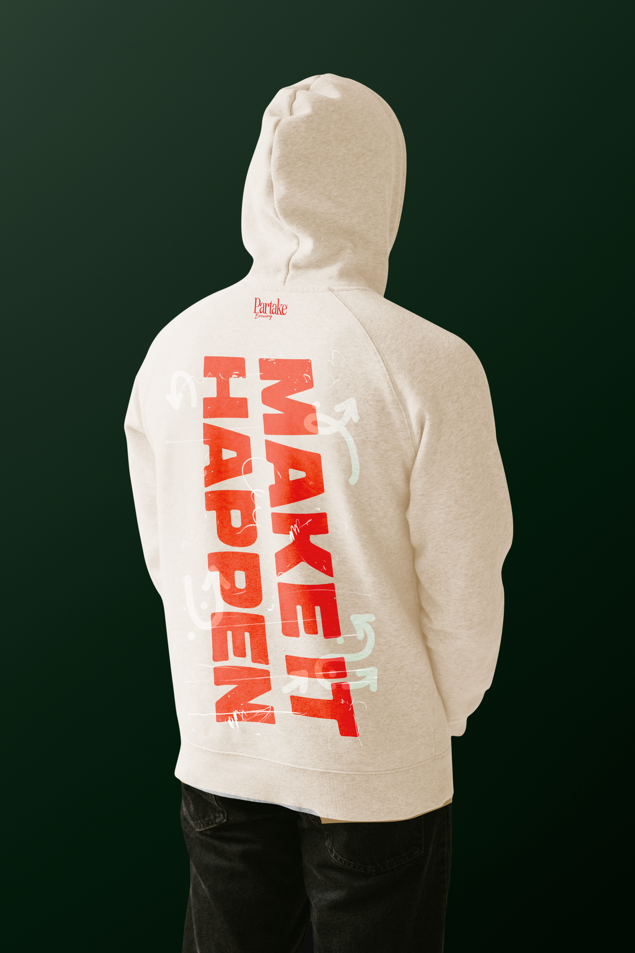
Choosing non-alcoholic beer? The ultimate act of rebellion with Partake.
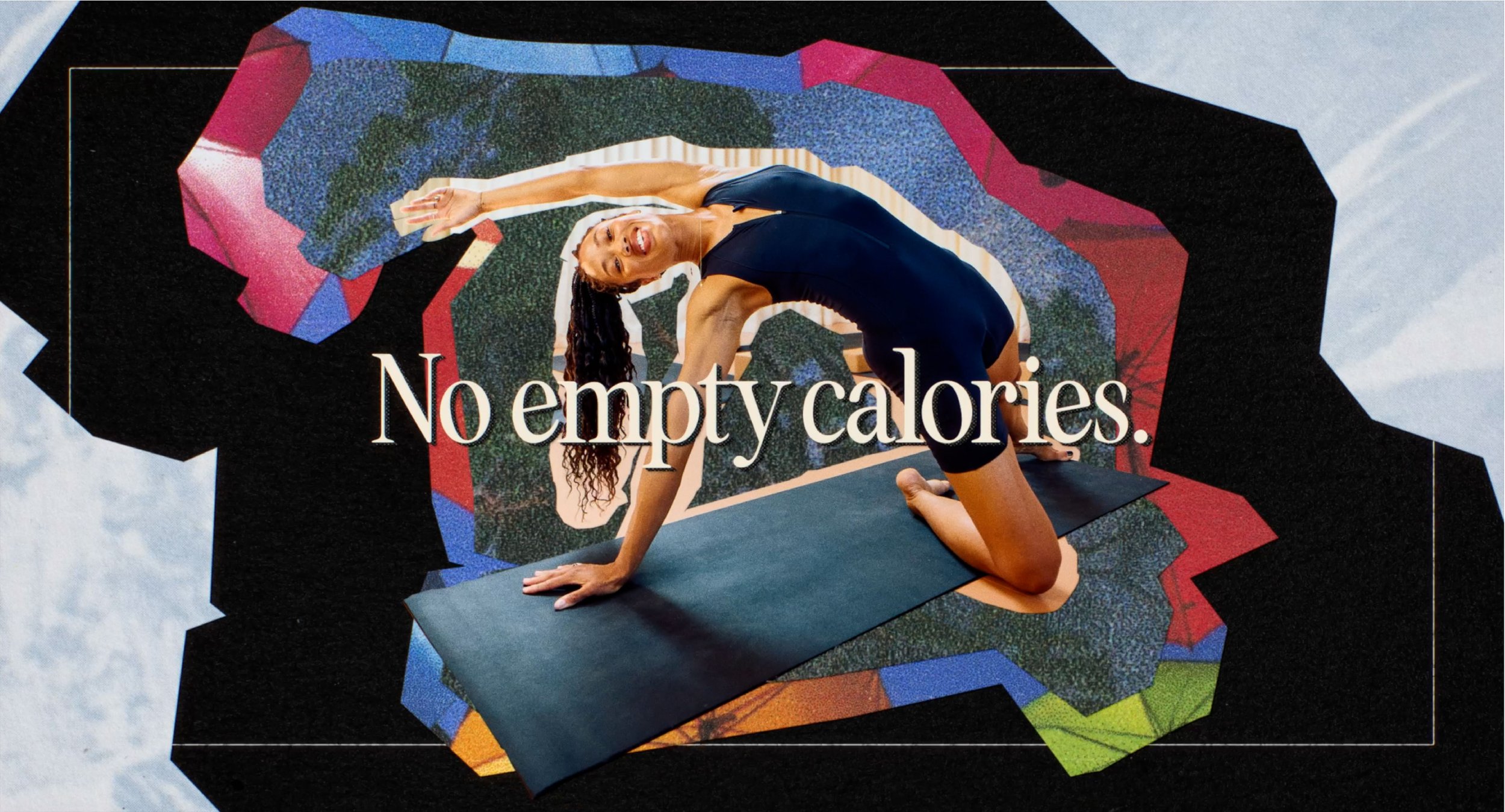
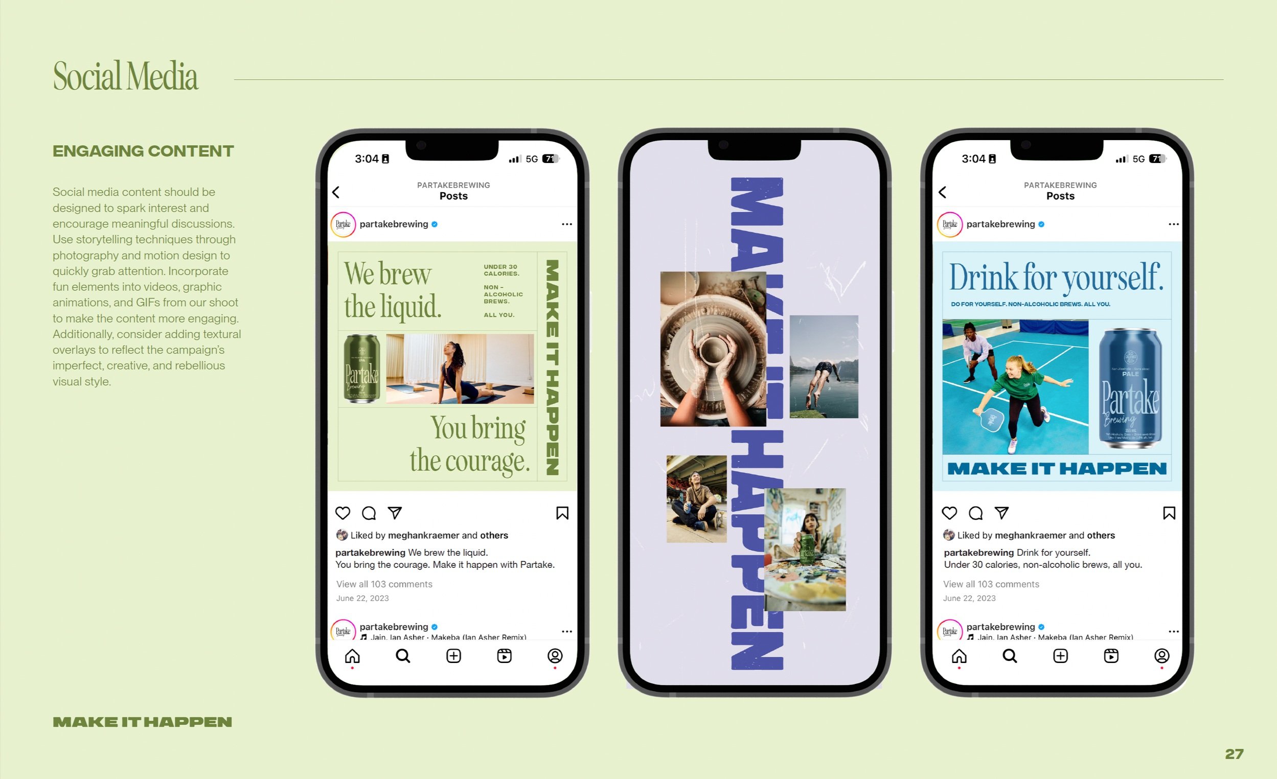
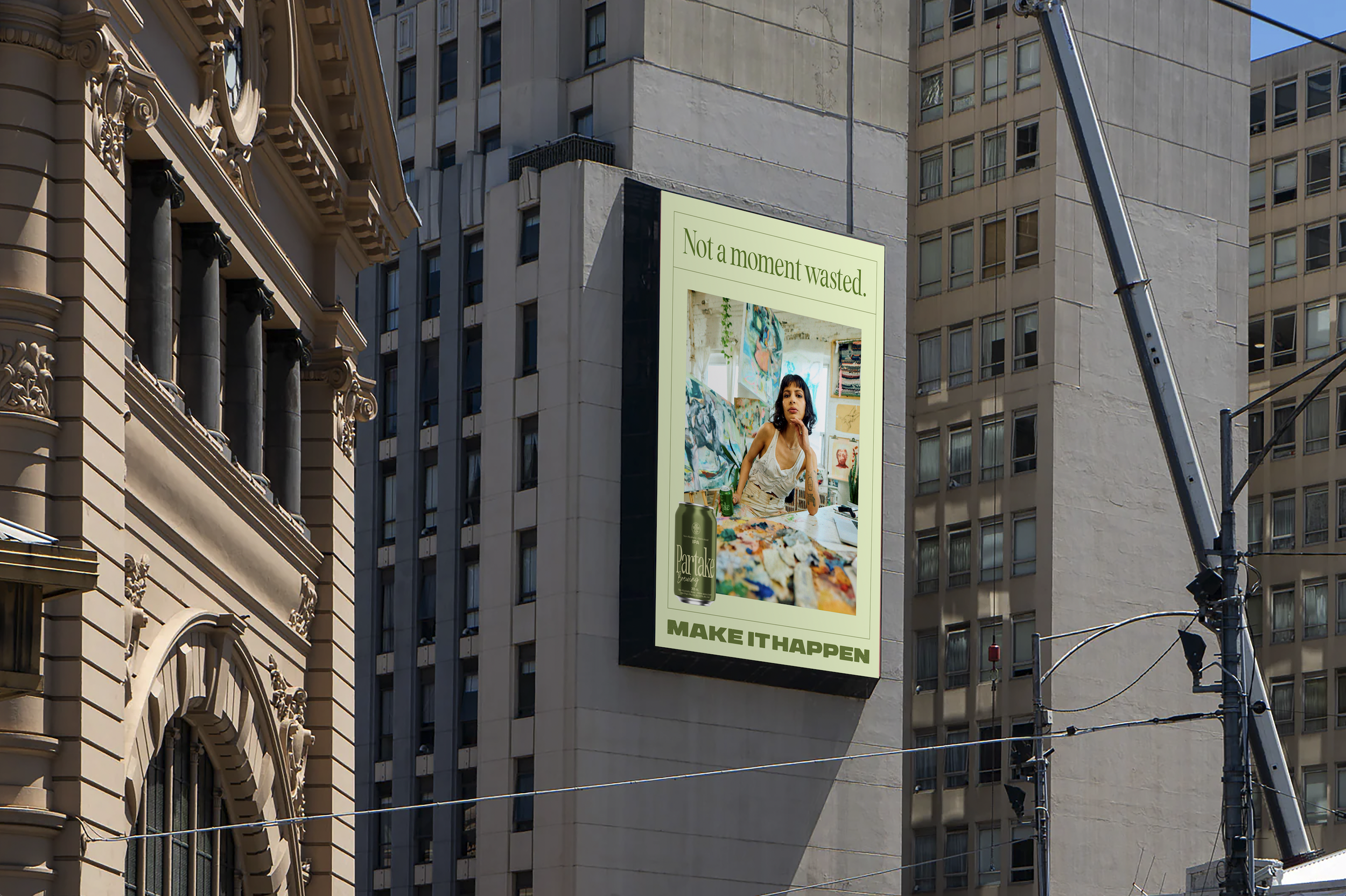
Partake approached us to create a bold brand platform for those who see not drinking as the ultimate rebellion. The "Make It Happen" campaign, featuring real Toronto creators shot in their own studios, celebrates the doers, makers, and risk-takers who embrace life and seize their mornings—sans hangover. In the rapidly growing NoLo alcohol space, Partake connects through emotional marketing, offering non-alcoholic beers that support a lifestyle of balance and joy. The campaign’s vibrant live-action, 2D, and CGI visuals reflect the brand’s ethos of resilience and spontaneity, creating a cultural shift towards living with "not a moment wasted."
Agency: Hard Work Club
Creative Director: Meghan Kraemer
Senior Designer: Priya Mistry
CD, Copywriter: Max Sollisch
CD, Art Director: Mike Kohlbecker
Director of Client Success: Emma Pratt
Director, Project Management: Cecilia Hui
Studio Manager, Production Designer: Amanda Braun
Senior Producer: Lindsay Hann
Photographer: Luis Mora
Motion + Colour: Studio Feather
Creative Director: Julian van Mil
Editor & Lead Motion Designer: Justin Wotherspoon
VFX & Motion: Sean Douglas, Karol Kisiel
VFX Assistant: Riley Lindsay
Colorist: Kevin Wu
Colour Assistant: Dima Chu
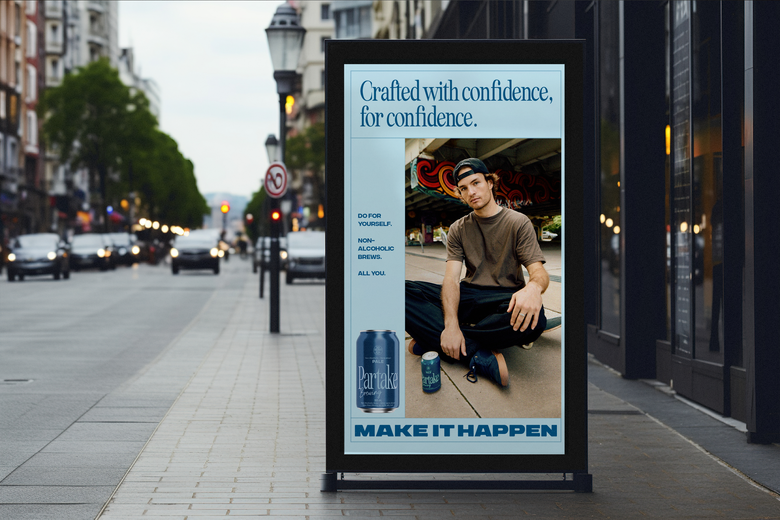
We partnered with real Toronto creators, capturing them in their own studios to celebrate the doers, makers, and risk-takers who embrace living life on their own terms.
Photography by Luis Mora, Art Directed by Priya Mistry
Biba Esaad, Painter & Designer
Sam Rose, Founder of The Yard Yoga
Cody French, Professional Skateboarder
In collaboration with Studio Feather, we envisioned a layered, textured and gritty spot—a visually compelling video that wasn’t afraid to showcase the process of making and becoming.

Visual Identity
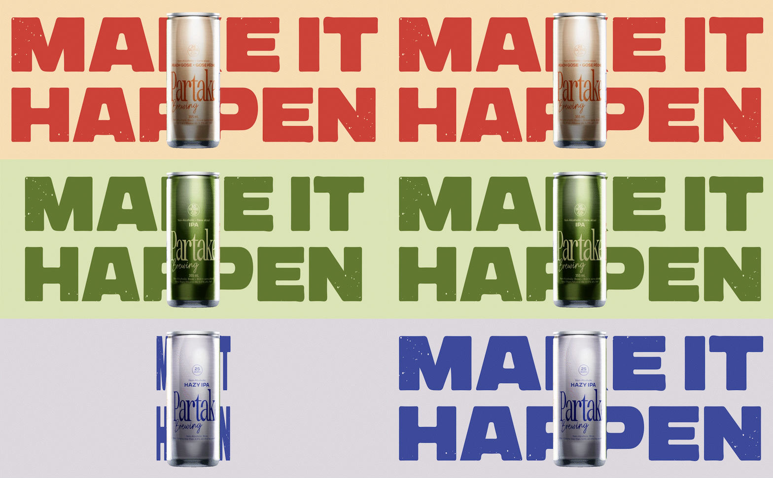
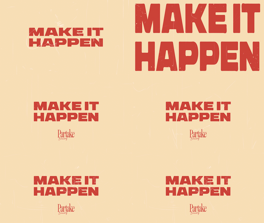
A cohesive campaign identity built for flexibility and story-telling.
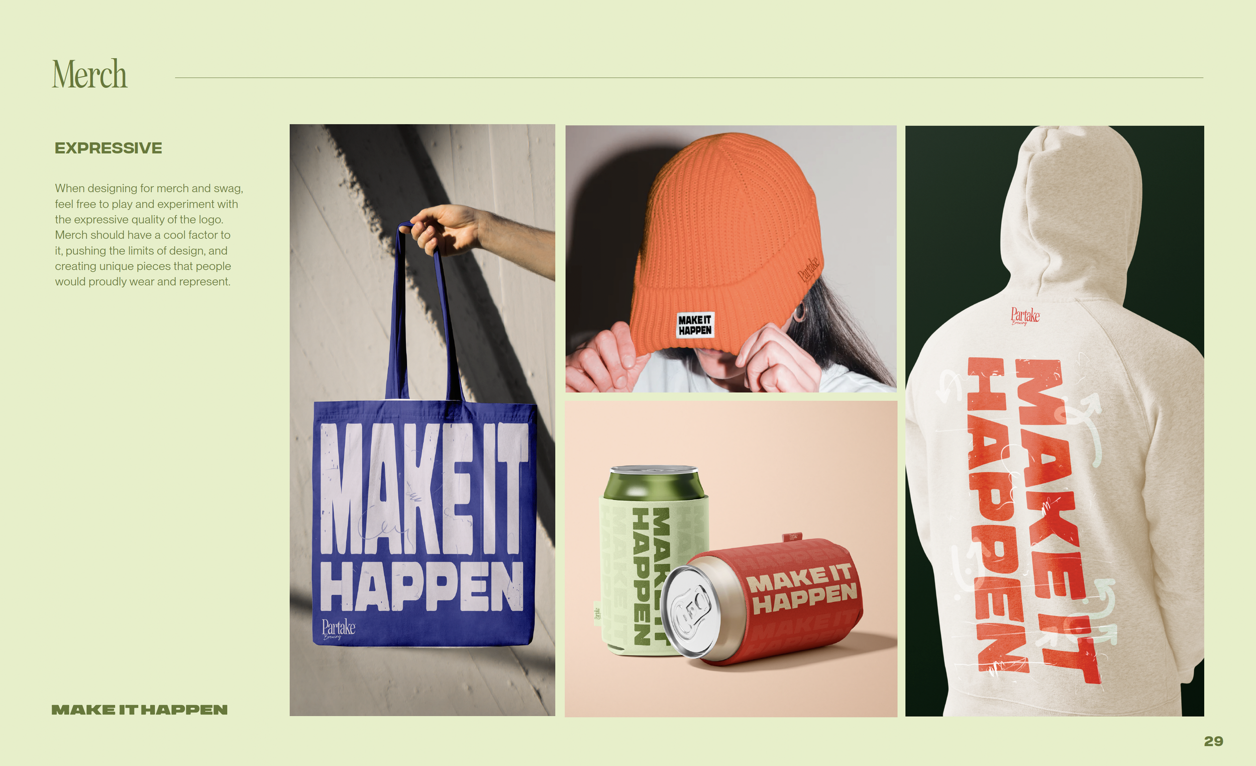
I developed a cohesive visual identity for Partake that is built for bold impact and rooted in human storytelling. At its core is a dynamic, ownable logo infused with energy, reflecting the spirit of those constantly pursuing their passions. The logo is designed to adapt, contracting or expanding based on its application, always reshaping itself to fit the context. With hand-rendered sans-serif letterforms, the typography establishes a strong, commanding presence while maintaining a personal and approachable feel. This unified system and grid create a visual identity that is flexible, yet consistent, making a lasting statement in every execution.


“Partake won me over. It’s a message that stuck with me — a true reflection of mindful living. The experience, from the personalized outreach to the impactful storytelling, made me a forever fan.”


